Diamine Inkvent 2021 – Day 25

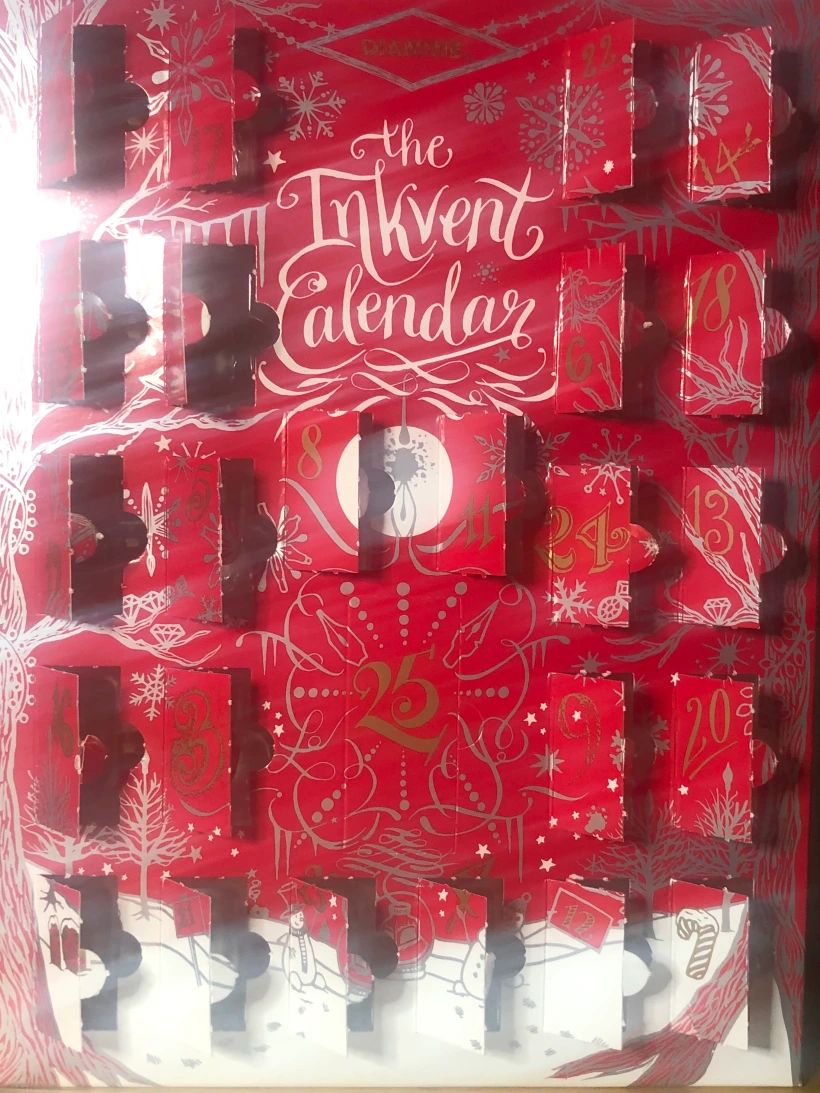
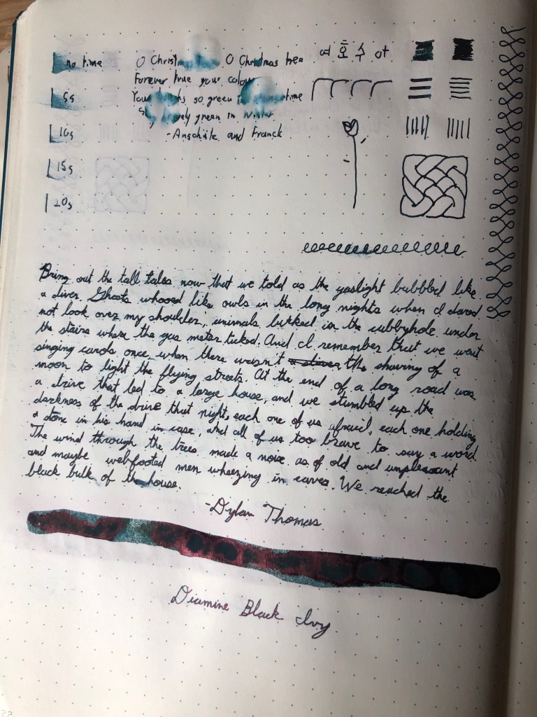
It’s Christmas day and we’ve come to the end of 2021’s Inkvent Calendar. I intend to do a write-up in the coming days on the calendar as a whole, but before we get there, we have one more ink to review. The final ink of Inkvent 2021 is called All the Best, a nice sentiment to carry into the new year. It’s a dark red/burgundy ink. I’m unsure of what effects this ink is supposed to have as Diamine doesn’t label their full bottles with that information, but it’s certainly got shimmer and I could make an argument for it being a sheening ink as well. At any rate, this is the big ink and no matter what it was, I was going to be very interested to try it out.

A bottle of Diamine All the Best

Firstly, let’s talk about the colour. It’s a very rich dark red with hints of purple in darker patches. It’s a good colour to write with, and doesn’t shade too much, though there is a hint of it. The colour itself is lovely and I’m pretty happy with it. There’s shimmer in All the Best, but it doesn’t show up unless put directly under light. Then you see the particle spread throughout the lines and they shine a light blue that comes close to taking over the colour, but not quite. As for sheen, I’m not one hundred percent sure on this. I do believe that All the Best will be listed as having shimmer and sheen as Diamine went all-out in this regard last calendar, and I probably will list it as such, but it’s not a colour change that one would see in normal writing, but more where there’s a lot of ink. When it sheens, it sheen a nice yellow with hints of green, which is fitting for this ink. However, it doesn’t sheen very often.

Diamine All the Best on Rhodia paper

The writing experience with this ink was about what I expected, which is to say: not great. I got a lot of feedback off the page; more than I found comfortable. I had a few hard starts and issues with ink flow where my pen would stop writing in the middle of a line. It’s certainly not ideal, and I’ll definitely be using a broader nib pen with this ink going forward.

Diamine All the Best on Leuchtturm paper

The dry time of All the Best in interesting, as it seems rather average, but takes a really long time to dry on my Leuchtturm paper, but no time at all on my Rhodia and Midori. Now, the ink flow issues might have played a role hear, but it was intresting to see such a big difference. My Leuchtturm tests always took the longest to dry, but normally if there was a long dry time there, the other two samples would have relatively long dry times as well. In any case, I did have some trouble with smudging my writing on the Midori and Leuchtturm tests. The ink is pretty saturated, so while the colour was rich, I had a bit of bleed through. Finally, there’s no water resistance with All the Best. It smeared immediately on contact with water and faded quickly. I was unable to recover my writing after the tests.

Diamine All the Best on Midori Paper

I’m not sure where I stand on All the Best. I love the colour, I think there’s a perfect amount of a shimmer and, if I had to nitpick, I’d like the sheen, if there’s supposed to be any, to be more apparent. And I think I’d set aside my writing experience and make accommodations to be able to use this ink comfortably. but the dry time and smudging pose an issue, and I’m not sure I can find a way past that. I’m certainly going to try, and I’m not unhappy with this ink. I’m actually pretty excited and intrigued by it. I think it’s a suitable end to this calendar. But I have to acknowledge that it isn’t the best ink for me, as much as I’d like it to be.

But with all of that said, I agree with the sentiment that Diamine expresses with this ink. I wish you all a happy Christmas, a joyous holiday season and, in all things, all the best.

The conclusion of Dylan Thomas’ “A Child’s Christmas in Wales” in Diamine All the Best

Diamine Inkvent 2021 – Day 24

It’s Christmas Eve and that means, among other things, that we are getting well and truly near the end of this Calendar. The penultimate ink of Inkvent 2021 is called Yuletide, which is a suitable name for the holidays. It’s a standard, dark teal ink, which was an interesting choice for the final ink sample of this set. (Note than Day 25’s ink is a full bottle.)

A bottle of Diamine Yuletide

With no shimmer or sheen, Yuletide stands on its colour alone. It’s a deep, teal colour that shades a bit and is quite nice to write with. It’s rich but isn’t too dark, letting it be a distinct ink, even through an extra-fine nib. And as much as it isn’t a sheening ink, I did catch a glimpse of red sheen occasionally, though not enough to intrigue me. It’s certainly nice and I think I’d like to use it more.

Diamine Yuletide on Leuchtturm paper

My writing experience with Yuletide was about what I expected. It has some feedback, but not too much and writes consistently. I had no ink flow issues or hard starts, and would have been shocked if I had. The lines I got were crisp and the ink was relatively well-behaved.

Diamine Yuletide on Midori paper

The dry time’s nothing to write home about, being on the shorter end of average and I didn’t have trouble with smearing my writing, save for one instance on my Leuchtturm. It’s a fairly saturated ink and I had some ghosting and bleed-through, though not too much. There’s no water resistance either. This ink smeared upon contact with water and washed out quickly. There was much left to recover after my water test.

Diamine Yuletide on Rhodia paper

Yuletide continues the trend of being a solid ink that relies on its colour to be unique. I have nothing to complain about as it didn’t underperform in any test and was very useable for me. However, whether you like this ink or not comes down to whether or not you like the colour. (This largely true for all inks, but doubly so if an ink doesn’t do anything special.) It’s certainly a nice colour and I’m keen on it. I’m certainly looking forward to using it more. However, I’m not sure if I would buy a bottle of it.

A continuation of Dylan Thomas’ “A Child’s Christmas in Wales” in Diamine Yuletide

Diamine Inkvent 2021 – Day 23

We’re coming up on the end of Inkvent and I’m excited to see what the final few days have in store. Day 23’s ink is called Wonderland, which would have made finding a water resistance test text easy, had I not already used Winter Wonderland earlier. Hindsight and all that. It’s a standard orange ink and I was curious to see if it had any surprises to offer.

A bottle of Diamine Wonderland

The first thing that I noticed was how unsaturated this ink is. I can look clear through the sample bottle and this lack of saturation shows. Cleaning my pens was easy and I had very little bleed-through with this ink. There was some, but much less than average. The dry time was relatively quick, falling on the short end of average. Testing Wonderland through an extra-fine nib gave me some very vivid orange lines, but this is one ink that I don’t recommend a stub nib for. It may be personal preference, but Wonderland didn’t look very good in sections were the ink was lighter.

Diamine Wonderland on Leuchtturm paper

However, it is a very bright orange, nearly fluorescent. Adding to this is the fact that this orange is a bit more yellow than red. It can be a very rich colour, and certainly an unforgettable one within this calendar. But Wonderland rides and dies on the colour alone. There’s no shimmer or sheen for added interest. For my money, I’m intrigued by this colour. It’s certainly plain and one-note, which are not things that I want from an inkvent ink, and I’m not madly in love with it, but I’m having a hard time dismissing it as “not my colour.” I think I like it more than I think I should, considering it misses a lot of boxes.

Diamine Wonderland on Midori paper

The writing experience with this ink was as expected. My lines were consistent and crisp, I had no ink flow issues and hard starts and I didn’t get too much feedback off the page. Nothing to complain about and nothing surprising. Wonderland is certainly not water resistant. While it doesn’t smear, it fades quickly and completely. I couldn’t make out anything I wrote in my water test.

Diamine Wonderland on Rhodia paper

Overall, Wonderland’s more exciting to me than it should be. It’s very plain ink with nothing, save the colour, that stands out. And I think that this ink really depends on the colour. If you like a bright orange, you’ll be happy with this ink, no question. If you don’t, there’s nothing else that’ll attract you to it. For me, I’m not sure exactly what I feel. I’m certainly not compelled to buy a bottle of it, but I do, for some reason, like it.

A continuation of Dylan Thomas’ “A Child’s Christmas in Wales” in Diamine Wonderland

Diamine Inkvent 2021 – Day 22

Day 22’s ink is called Black Ivy, which is about as cool of an ink name as you’d get. There’s a certain quality about it that makes it stand out to me. It’s an extremely dark green ink with sheen, which fits the name perfectly. I was very excited to give this ink a whirl.

A bottle of Diamine Black Ivy

The big thing about Black Ivy is the colour. True to it’s name, it’s a very, very dark shade of green and almost appears like a black ink when I tested through an extra fine nib. But even then, I was able to tell that this ink was green. It’s impressive to see an ink pushed to the edge like this. This ink shades well and the lighter areas show off some interesting things about the colour. Firstly, as a green it leans more into blue than yellow and has a slight undertone of grey. It actually resembles the colour of winter greenery quite well. While I’m normally keen on sheen, it doesn’t really do much for me in Black Ivy. This ink sheens red and it’s always a cool effect to see a colour get replaced when you shine light on it, but I think the colour of this ink was good enough that it didn’t need sheen. Of course, I am totally nitpicking.

Diamine Black Ivy on Rhodia paper

The writing experience with this ink was pretty good. It’s one of the smoother inks in this series and I only got a little bit of feedback off the page. The lines I got were crisp and consistent, and I really enjoyed writing with this ink. While I didn’t have any major ink flow issues, I did get a couple of hard starts that took a moment to fix, normally after having set my pen down for a little bit. They were quick and easy to fix, but happened a little too often.

Diamine Black Ivy on Midori paper

This ink is very saturated and cleaning it out of pens and off of hands is not an easy task. I had a bit more ghosting and bleed-through than normal, but not an egregious amount. The dry time on this ink is on the long side of average, and I had a couple of instances of smudging my ink sample (though the smear on my Midori swab was just me being careless.) There’s no water resistance to speak of as my writing smeared instantly on contact with water and faded quickly. There was no chance of reading my writing after the test.

Diamine Black Ivy on Leuchtturm paper

Overall, I really like Black Ivy. It’s fairly functional and a really interesting colour to me. A lot of the drawbacks that I’ve noted don’t really affect me, though the longer dry time did have me worried. I’d certainly avoid using Black Ivy in my Leuchtturm. Bu this ink checks off a lot of what I expect an Inkvent ink to be. I’d certainly be interested in acquiring more, though it’s not an everyday ink for me.

A continuation of Dylan Thomas’ “A Child’s Christmas in Wales” in Diamine Black Ivy

Diamine Inkvent 2021 – Day 21

Day 21’s ink is called Brandy Snap and it’s a standard brown ink. While I never look for brown inks, I’m always very interested to see how they look, and this one is no expectation.

A bottle of Diamine Brandy Snap

Brandy Snap is a light brown ink with no shimmer or sheen, which makes it sounds more boring that it is. This brown has more of a yellow tint to it, which is fairly apparent in sections where the ink is darker. It also shades really well and almost looks like a dull gold in lighter areas. It’s suitable for writing, but also looks very cool through a broader nib.

Diamine Brandy Snap on Midori paper

My writing experience with this ink with as expected. I got quite a bit of feedback off the page and it was on the higher end of what I find comfortable. However, my lines were consistent and I didn’t have any ink flow issues. Overall, I have no complaints here.

Diamine Brandy Snap on Leuchtturm paper

The dry time on this ink was about average and I didn’t have any trouble with smudging my writing samples. Brandy Snap was actually quite impressive in the water resistance department. It didn’t smear very much and didn’t wash out very much. I’d have to say that I could recover most of my writing after my water test.

Diamine Brandy Snap on Rhodia paper

Overall, I have nothing to complain about with Brandy Snap. The colour’s interesting and it preformed fairly well through most of my testing. I’m certainly going to use up the sample that I have. I’m not overly enthused by Brandy Snap, but there’s no denying that it’s a good ink.

A continuation of Dylan Thomas’ “A Child’s Christmas in Wales” in Diamine Brandy Snap

Diamine Inkvent 2021 – Day 20

We’re entering the home stretch, or at least what I consider the home stretch, of this calendar, and I have to say, I’m becoming very curious of what the big bottle of ink behind door 25 is. But before we get there, we still have inks samples to review.

A bottle of Diamine Pink Ice

Day 20’s ink is called Pink Ice, which someone will have to inform me of whether it’s a real thing in the world or not. It certainly sounds fantastical. It’s a pink in with shimmer, which I think we can all agree is fitting. In any case, I was fairly eager to test this one out.

I want to get this out of the way: the writing experience was about what I expected, that is to say: not great. I had a lot of feedback off the page with this ink, though it wasn’t overly uncomfortable. And, for the most part, Pink Ice flowed aright, but I ran into some problems with a few inconsistent lines, a couple instances of the pen dying in the middle of a word and some hard starts. Nothing major considering my tests are not where shimmer inks excel and I definitely recommend a broader nib if you’re using this one.

Diamine Pink Ice on Midori paper

The colour is pretty good though. It’s a light pink that shades well and has a bit of depth to it. I’d compare it to the colour of pink bubble gum or candy floss. It’s certainly not a unique pink, but it is an iconic one. The shimmer adds another layer to this ink, but I’m not sure if it registers. It’s very subtle with small flakes throughout. It glitters a bit when you chine light on it, but doesn’t take over. I honestly could take it or leave it and it seems the colour is the star of the show.

Diamine Pink Ice on Rhodia paper

Pink ice is is not as saturated as some inks we’ve looked at in this calendar and cleaning wasn’t much of an issues. I had some ghosting and bleed through, and, while it it was more than I expected, it was less than usual. The dry time is fairly average and I didn’t have issues with smudging my writing. My water resistance tests were interesting. Pink Ice is far from water proof, but it didn’t smear much when water was applied and the colour didn’t wash out as dramatically as other inks. In two of three cases, I was likely going to be able to recover my writing. Again, keep drinks away, but Pink Ice does fight back a bit.

Diamine Pink Ice on Leuchtturm paper

Overall, I’m pretty happy with this ink. I had nothing to complain about regarding the writing experience, expect that I should use a different pen and the colour’s pretty nice, if a but uninteresting to me. I think Pink Ice is a fine pink ink, but pink’s not my colour unless it’s really interesting. But I’m not unhappy and I suspect that there will be a couple people who are overjoyed.

A continuation of Dylan Thomas’ “A Child’s Christmas in Wales” in Diamine Pink Ice

Diamine Inkvent 2021 – Day 19

Day 19’s ink is called Festive Joy, and it’s a standard, dark purple ink, the second we’ve gotten this calendar. Interestingly, the other was called Harmony, which is another concept that I have trouble associating with a colour. Of course, being the second of a type in a series invites increased scrutiny as it’s being compared to what came before. And what are we here for except to scrutinize inks?

A bottle of Diamine Festive Joy

Firstly, the colour. I didn’t expect Diamine to pull a fast one and reuse a colour, so my main interest was in what differences there were. And there were quite a few. In fact, being standard dark purple inks is where the similarities between Festive Joy and Harmony stop. This ink is richer and darker, with a bit more blue in it. It shades a little, but is a perfect writing ink for the colour. And despite not being a sheening ink, I actually got quite a bit of metallic, gold sheen. This occurred where I used a lot of ink and in places that were quite dark and was especially visible under light. This occurred on my Midori and Leuchturm tests, but not in my Rhodia notebook, which I expected since my Webnotebook is where sheen goes to die. I had a very high opinion of Harmony, and I think I like Festive Joy’s colour better. It’s more interesting and more to my tastes.

Diamine Festive Joy on Midori paper

The writing experience of Festive joy was as expected. There was some feedback off the page but I had no ink flow issues. the lines I got were consistent, crisp and loaded with colour. The dry time was pretty unremarkable, being about average, though I did smear some of my writing samples.

Diamine Festive Joy on Leuchtturm paper

The ink is pretty saturated, which adds to its rich colour. However, cleaning my pens was a bit of a chore and I got a fair amount of ghosting and bleed-through. Perhaps a little more than average. The water tests for Festive Joy all came to the conclusion that one should not mix drinks with this ink. The letters smeared and washed out easily, though my sample on the Rhodia put up a decent fight.

Diamine Festive Joy on Rhodia paper

I’ll admit that I wasn’t too keen to test this ink. It felt a bit plain and having something very similar to it earlier didn’t help its case. But Festive Joy surprised me. I like the colour and find it super interesting. There’s nothing to complain about within it’s properties or writing experience. I was very pleased by Harmony, but this ink has displaced it as the purple ink that I would buy from this calendar. Now, Festive Joy isn’t flashy and I imagine there will be people disappointed by it. I was certainly almost in that category. It’s like Thunderbolt, from a couple of days ago, in this regard. At it’s core, it’s a good, solid ink, but if you don’t really like the colour, there’s not much for you here. What turned me around was the unexpected sheening. Without that, Festive Joy gets the same sort of review. But, as it stands right now, it’s a winner.

A continuation of Dylan Thomas’ “A Child’s Christmas in Wales” in Diamine Festive Joy

Diamine Inkvent 2021 – Day 18

Day 18’s Inkvent ink is called Subzero, which, considering the amount of snow that I’m currently looking at, seems like a fitting name for an ink. It’s a light blue/turquoise ink with shimmer and a few interesting things revealed through testing.

A bottle of Diamine Subzero

Firstly, we haven’t seen a light blue ink on this calendar yet, which is interesting considering the wealth of blue inks we’ve seen so far. Even more interesting is that the last light blue ink I tested with day 1 of 2019’s calendar: Blue Pepperment. I suppose it’s a colour that I’m always intrigued by, but never seek out. That said, Subzero is lovely. It’s certainly light, but has a depth and richness to it that wasn’t present in Blue Peppermint. It’s helped by the fact that it’s a bit darker. I don’t know that the shimmer is doing much here. It’s very subtle and while it’s certainly present, it doesn’t really show up unless you shine a light on it, and even then, it’s not dominant. And while I like the effect, having this be a standard ink would have worked just as well.

Diamine Subzero on Rhodia paper

The less prominent shimmer probably contributed to a better writing experience for this ink. Subzero is fairly smooth and doesn’t have much feedback at all. The lines I got were consistent and I didn’t have any ink flow issues. There were no hard starts or frustrations when writing with this ink, which was quite impressive.

Diamine Subzero on Leuchtturm paper

The dry time on Subzero is fairly short, which is always a plus for lefties, and I didn’t have trouble with smearing letters. While this ink looked fairly unsaturated, it kicks out some serious colour, even when pull through broader nibs. And it would a great writing ink in my extra-fine Kaweco. That said, I also had more bleedthrough than I expected, though it wasn’t much more than average. There’s no water resistance to speak of with Subzero. It doesn’t smear right away, but the colour does wash out after a while and I wasn’t able to easily recover my writing after a water test. It’s not disastrous, but it is certainly less than ideal.

Diamine Subzero on Midori Paper

Subzero is the second ink in a row that I think is pretty good and solid, but I’m not overly enthused by. I think the colour is excellent and it has a lot going on. I was by no mean bored with this ink. The writing experience was also a pleasant surprise and I had no real complaints. I think what’s getting me on this ink is that light blue isn’t really my colour. I prefer darker inks. That said, I’m sure there are a lot of people that are really happy with this ink, and they’re right to be. If you like this colour, this ink’s for you. It just isn’t for me.

A continuation of Dylan Thomas’ “A Child’s Christmas in Wales” in Diamine Subzero

Diamine Inkvent 2021 – Day 17

Day 17’s Inkvent Ink is called Thunderbolt, continuing along a stormy theme that’s been present in a few of these inks. It’s a standard blue ink and I was curious to see if any surprises were revealed in testing.

A Bottle of Diamine Thunderbolt

Thunderbolt is a fairly plain, blue ink. Apart from the fact that there’s no shimmer or sheen, it doesn’t have much going on. No secondary colours to point out or things only seen when it shades. to it’s credit, it doesn’t shade quite nicely and the colour itself is, in my opinion, excellent. It’s a rich, vibrant blue that is about as blue as you can get. It bears some similarity to J. Herbin’s Eclat de Saphir, which was my go-to blue ink for a long time. In fact, I might like Thunderbolt better.

Diamine Thunderbolt on Midori Paper

the writing experience was fairly standard with this ink. there was some feedback off the page, but nowhere near an uncomfortable amount. I had no ink flow issues and the lines I got were consistent and smooth, with no hard starts. It’s an excellent writing ink and fairly well-behaved.

Diamine Thunderbolt on Rhodia Paper

The dry time of Thunderbolt is average and not troublesome for lefties. The ink itself is quite saturated, which lends it a richness in colour and makes for good, crisp lines. However, I had a decent amount of bleed-through as well, though it was no more than usual. There’s not water resistance to speak of as this ink smears on contact with water and either washes out or stays smeared. In either case, there was no chance of recovering my writing after the water test.

Diamine Thunderbolt on Leuchtturm paper

If you get the impression that I’m not overly enthused by this ink, you’d be right. There’s no reason to dislike Thunderbolt. I personally really like the colour, as simple as it is. And I had no real complaints about the writing experience. Frankly, I’m surprised at how much I actually like this ink. At the end of the day, it’s a good, solid ink and that’s worth a lot. I know I want to use up my sample and I might buy a bottle to use everyday if it was available. But I’m less than excited because of reason relating to the calendar itself. But that’s for another time. Overall, I have to give Thunderbolt two thumbs up.

A continuation of Dylan Thomas’ “A Child’s Christmas in Wales” in Diamine Thunderbolt

Diamine Inkvent 2021 – Day 16

Something I wrote about frequently during my 2019 Inkvent reviews was how evocative an ink was of it’s namesake. For some reason, that hasn’t been a theme in this series of reviews. However, day 16’s ink compels me to talk about how evocative it is. This ink is called Vintage Copper and it is a orange-brown with shimmer. I was very hopeful that this ink would be something special when I started testing it and it did not disappoint.

A bottle of Diamine Vintage Copper

The name, Vintage Copper, brings to mind images of old, classic French kitchens where ever pot and pan was highly polished copper, and I was hoping for something that matched that image with this ink. And it gets pretty close. This ink is a vivid, lighter brown that tints towards orange, which is a perfect colour to reference old copper pots. It also has gold shimmer which shows up, subtlety, throughout the ink. This adds a nice glint and glimmer, with only adds to the idea of copper cookware. It shades nicely, is good for writing and benefits from broader nibs. Overall, I love this colour, both as a stand alone colour and for how evocative it is.

Diamine Vintage Copper on Leuchtturm paper

The writing experience is a familiar story. I got quite a bit of feedback off the page and had a few ink flow issues. I didn’t have any hard starts, but there were times that a line would fade out in the middle of writing. Of course, broader nibs deal with this issue. With that said, these issues weren’t as prominent as with other inks in this series. Most of the time it worked decently and, when the ink’s flowing, I got good, crisp lines.

Diamine Vintage Copper on Rhodia paper

The dry time of Vintage Copper was a surprise. I expected it to take longer, but it’s on the shorter end of average, though I suspect that some of the ink flow issues helped with that. But it’s worth noting that I didn’t smear my writing samples, which is a good indicator that this ink is lefty-friendly. However, it did bleed through the page quite a bit. The water resistance also surprised me. Vintage Copper takes a while to smear when water is applied, though it will smear. And while the colour’s faded, it doesn’t wash out easily and I was able to recover my writing after the water test. I don’t mind a lack of water resistance, but it’s a big plus if an ink has it.

Diamine Vintage Copper on Midori paper

Overall, I really, really like Vintage Copper. It’s an ink that I would go out of my way to use. I love the colour, I love that it evokes an image and delivers on it and I love that it surprised me in a bunch of ways. There are flaws, but I’m definitely overlooking them for all the ways this ink succeeds.

A continuation of Dylan Thomas’ “A Child’s Christmas in Wales” in Diamine Vintage Copper