Kaweco Perkeo Fountain Pen Review

Despite having this pen in my collection for a while, I never got around to reviewing the Perkeo. It’s a bit of an oversight on my part as it is firmly within the entry-level price range, and I generally like Kawecos. And while my list of favorite beginner fountain pens has remained unchanged from when I started keeping track, it’s always worth giving another pen to upend that list.

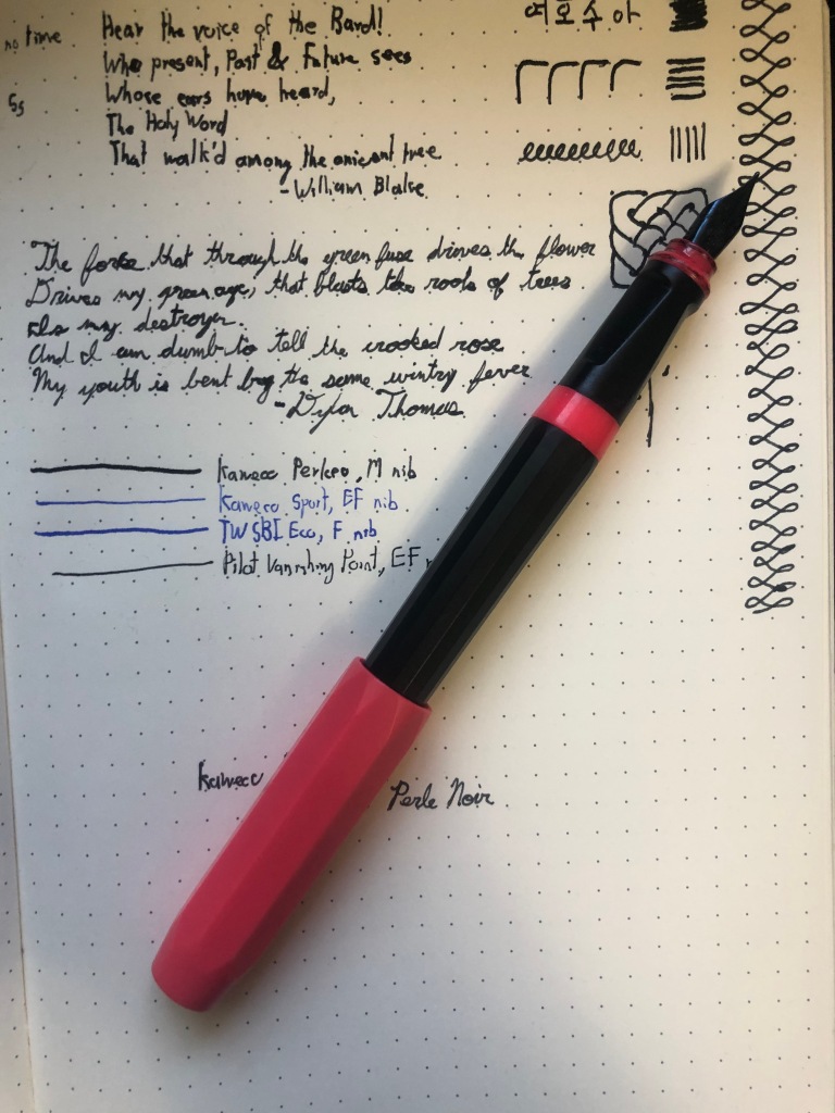
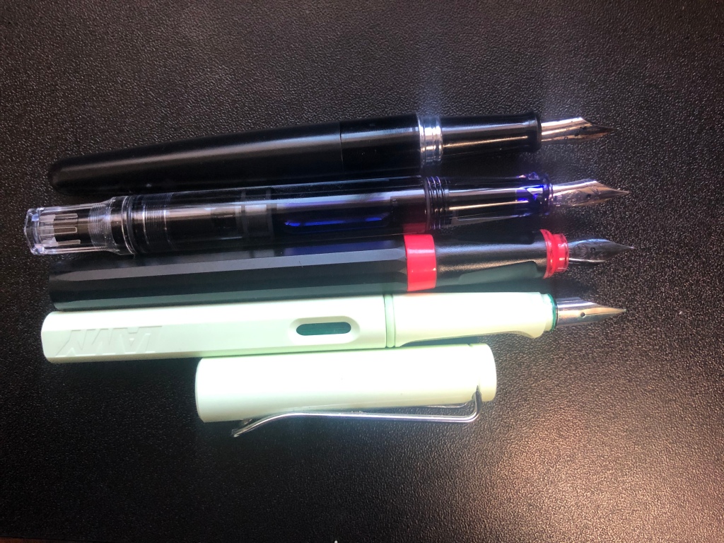
The Perkeo is a beginner fountain pen offered by the German company Kaweco, which also offers the pocket-sized Sport line. However, the more apt comparison would be with Lamy Safari, TWSBI Eco and Pilot Metropolitan, all entry-level, full-sized fountain pens. And this pen is falls right in line with the rest of them. The proportions are similar to that of the Safari and Eco, being about the same thickness and only slightly shorter. In fact, it’s as much of a middle ground as you can get between those two pens and the Metropolitan. As a result, it’s a familiar feeling pen, even having a moulded, three-sided grip like the Safari does. It’s not as pronounced as Lamy’s, but it’s significant enough to help line the pen up in one’s hand. Personally, I like this feature in pens, especially entry level ones. I think it helps teach a standard grip and I find it very comfortable. However, I know that some folks really don’t like the moulded grip and this might be a deal breaker for them. The pen is made from a smooth resin, which feels nice and warms well in the hand. I’ve never had a complaint with this material and I’m certainly not starting now.

However, the design of this pen is unique, to say the least. The body above the grip is faceted with 16 faces. This is enough to make the pen feel very nearly round, but each side is pronounced enough that you know it’s there. It’s an interesting decision that I’m not sure what to make of. On one hand, I think it’s cool that this pen has its own style. On the other, I’m not sure if I like it. I certainly don’t find it offensive, but it just doesn’t excite me. If I’m being profoundly uncharitable, I would say it reminds me of a marker. Your mileage, as they say, may vary.

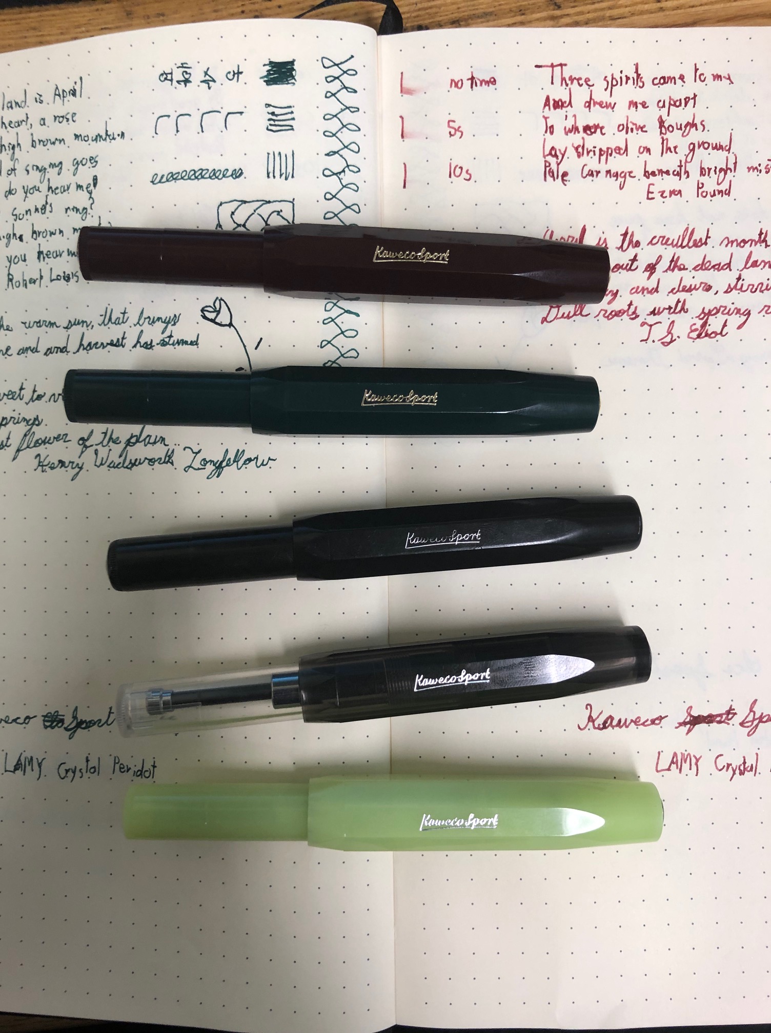
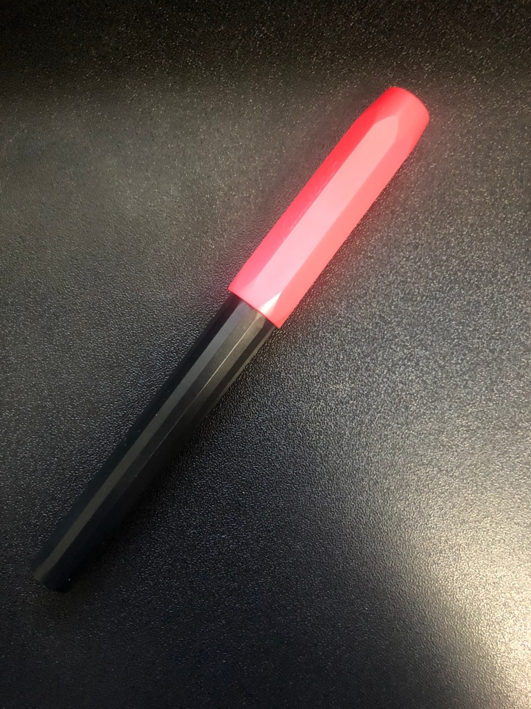
The colour scheme of the Perkeo continues the trend of of being unique. I have “Bad Taste,” which is the name of the colourway, not a reflection of me. It’s a black pen with a pink cap and highlights. There are a couple of other wild colourways, such as “Cotton Candy” (pink with grey,) and “Indian Summer” (yellow with black.) There are also a few more standard colours, such as an all black and a few pastelly ones. I will say that I’m not a big fan of the colours available except the all-black, but I can understand why people would like them.

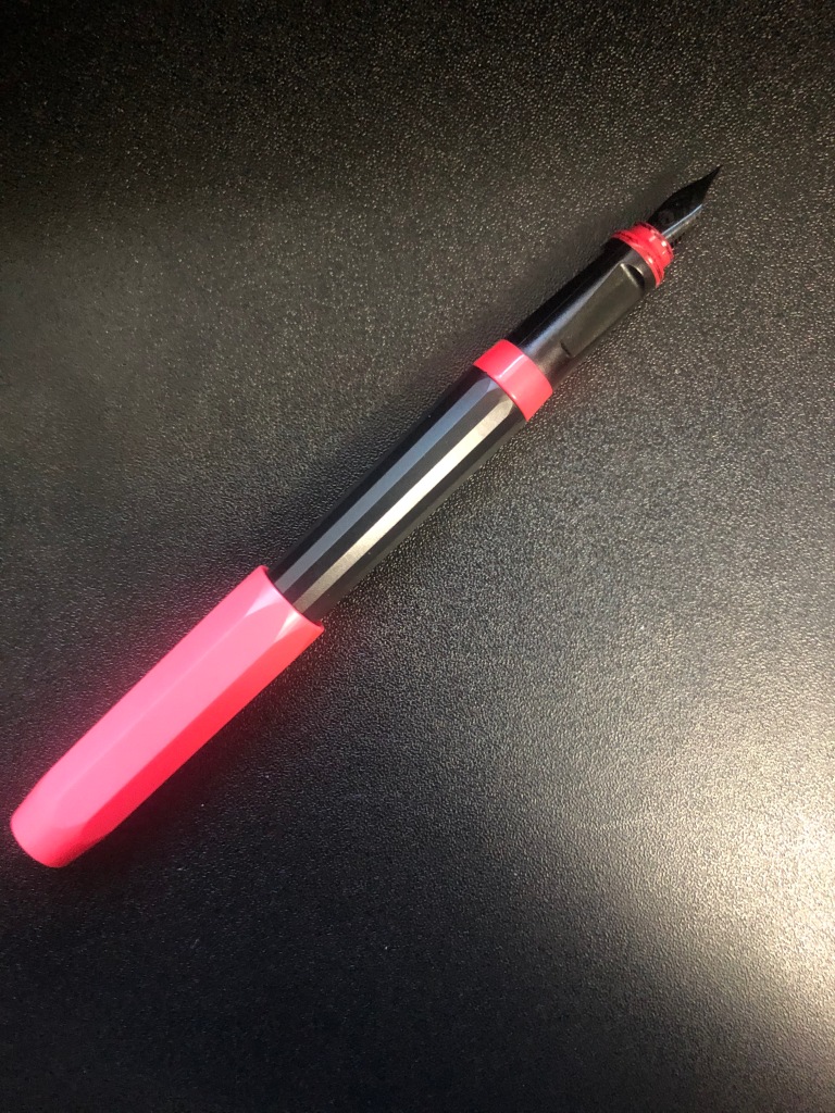
The cap is eight-sided, which makes it a great tool for preventing your pen from rolling away, with the Kaweco medallion on top. It’s a snap-cap, which holds to the pen very securely, but can be uncaped and recaped without using too much force, It is a postable cap, but I find that the writing experience is fairly similar with it posted or not. It is also worth noting that this pen does not have a clip, though one can be purchased separately.

The Perkeo weighs about 12 grams, which is certainly average for these pens, if a bit light for my liking. However, I like heftier pens and it’s not that for off, so this is not a negative note for it at all.

This is a cartridge filling pen, which makes it a good on-the-go pen since you don’t have to worry about a filling mechanism. It takes standard international cartridges and comes with a standard short international cartridge, However, if you’d like to use bottled inks, like I did, it takes both the Kaweco converter, which I would avoid, and the Schmidt K5.

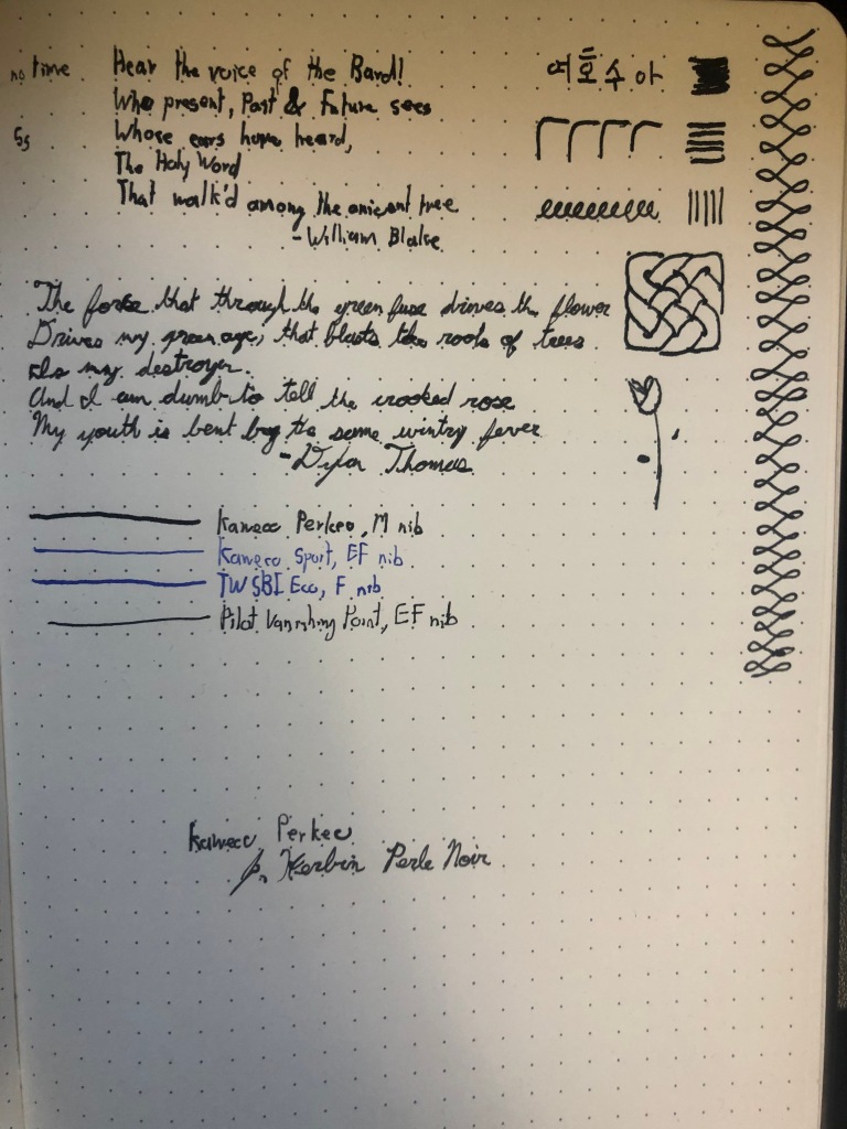
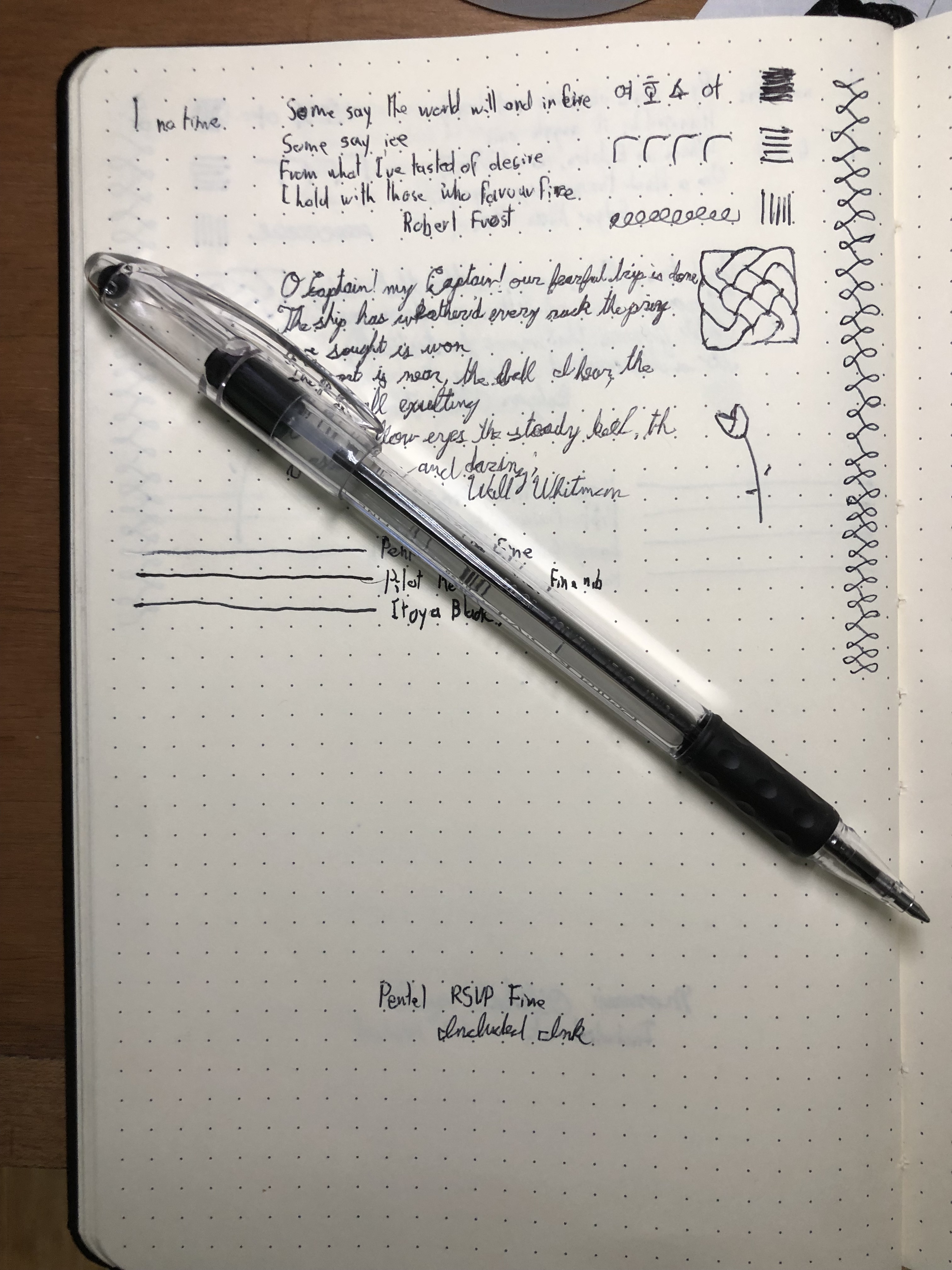
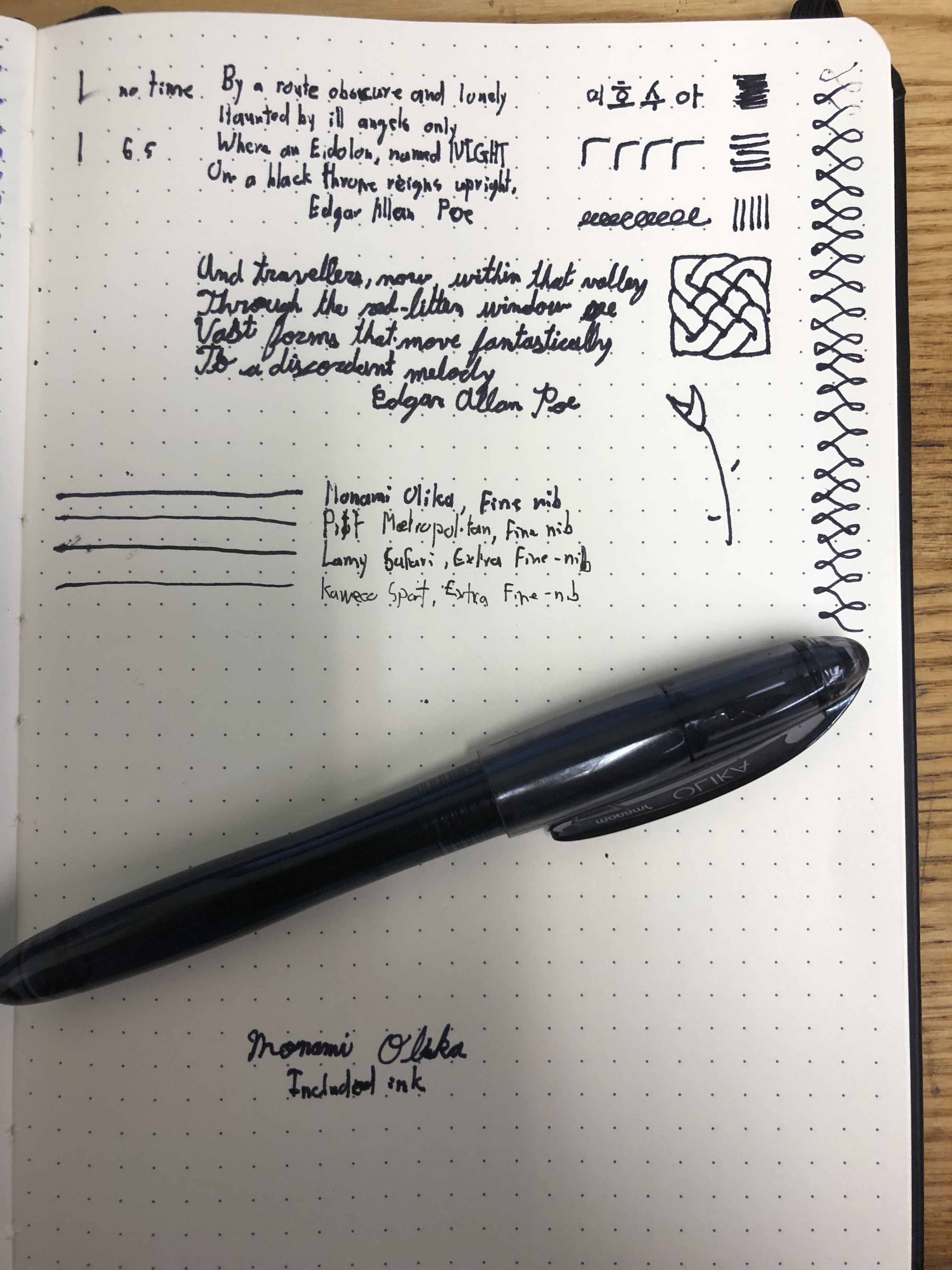
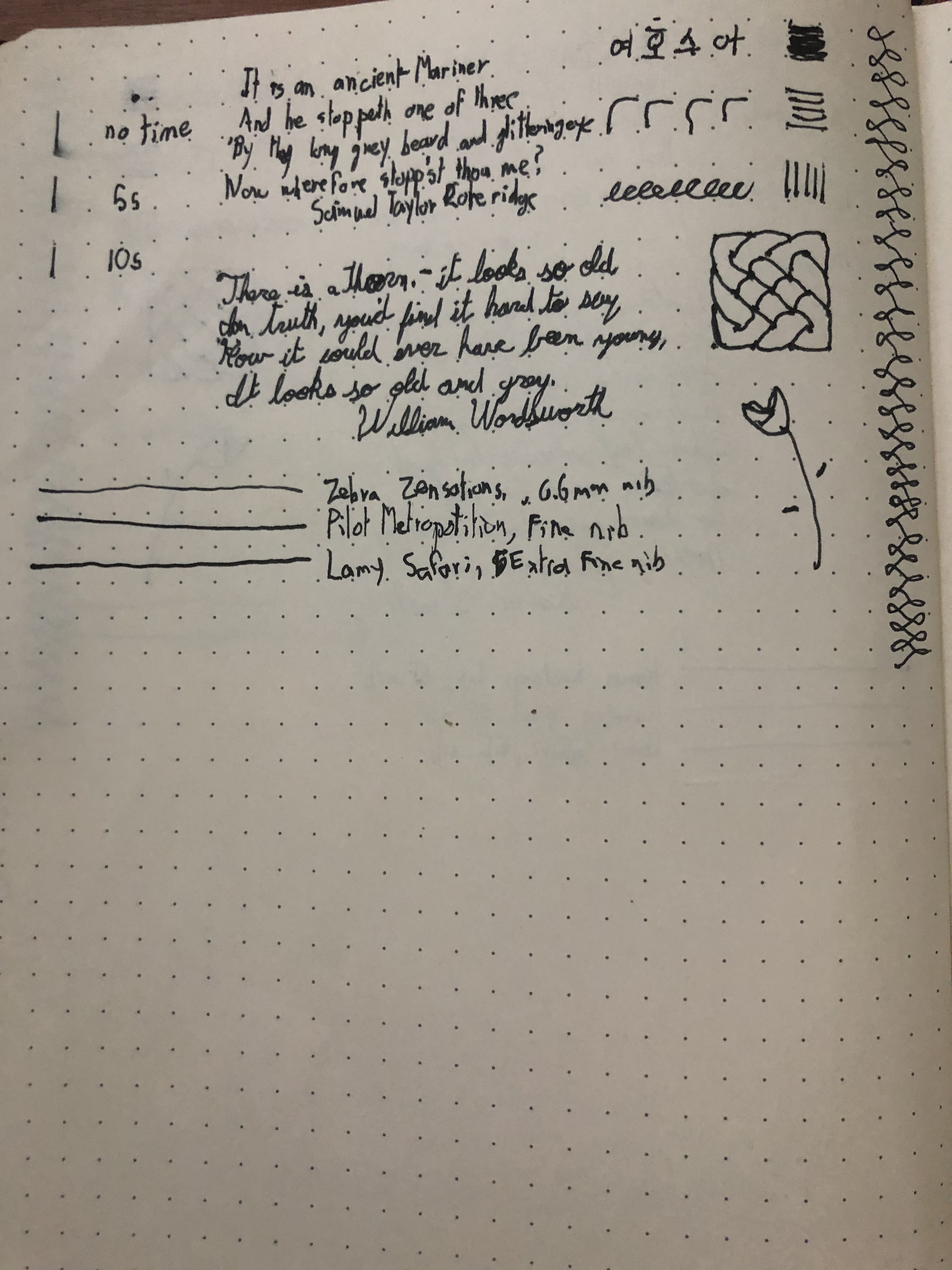
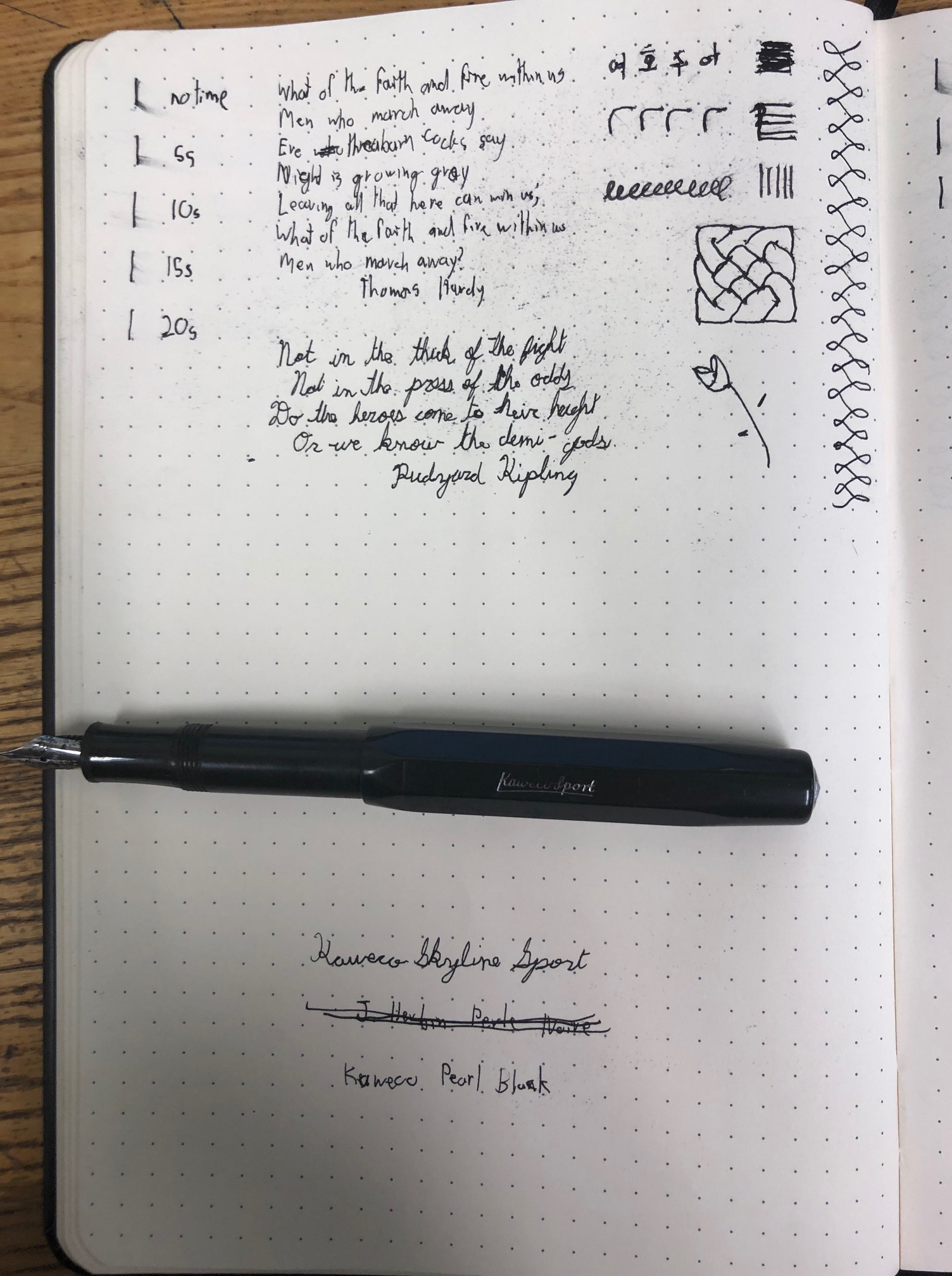
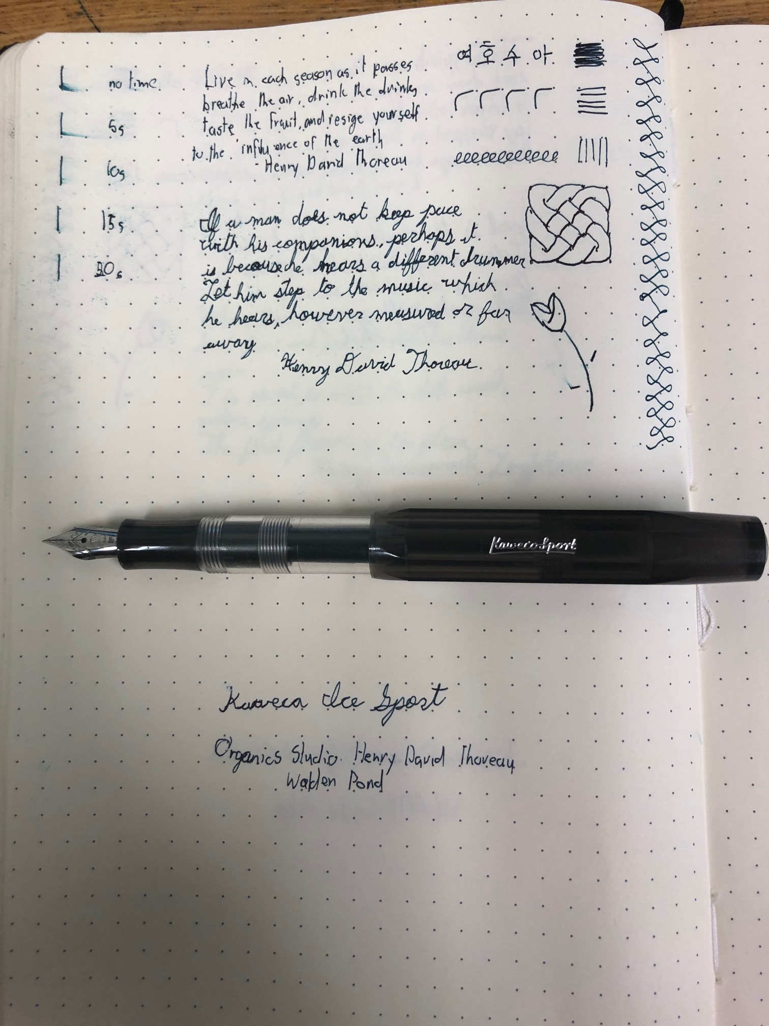
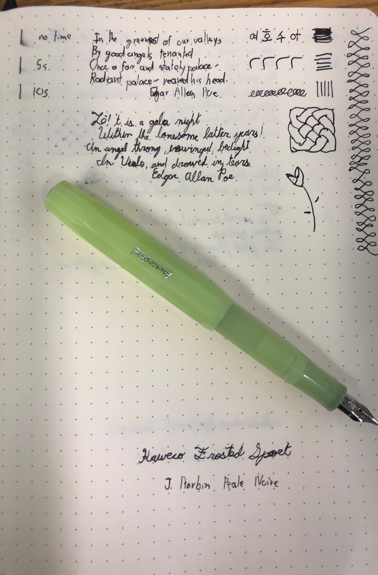
Now, the writing experience is where I’ve been sleeping on this pen. It has a proprietary steel nib available in medium and fine, which isn’t a lot of options. My pen has a medium nib, which is wider that I would like, but that doesn’t dampen my opinion of how this pen writes. It’s a very nice experience. It’s very smooth and puts down a lot of ink. I’d definitely recommend using a quick drying ink, such as J. Herbin Perle Noir, if you’re a lefty like me, but it certainly isn’t too wet and the line width is in line with other German nibs. I’ve had no issues testing it in my Rhodia Webnotebook and I’m confidant enough to say that this is a very consistent and very good pen.

The entry-level pen market is tough. At $17.00, it’s one of the cheaper options there is from a bigger brand. And there’s no objective reason to avoid this pen. It writes well, it feels good in the hand, it has a grip that I like and it does everything that I would want it to. I’d recommend it as a first fountain pen. The only real downside is the limited nib selection, which is a bummer. Even when I was starting out, I quickly learned that I liked finer nibs than this pen has to offer. Despite that, I know most of my hesitation with this pen is because I’m not fond of the aesthetic. If you’re like me, or you don’t like the triangular grip, there are options that would suit you for slightly more; that’s what makes this price point tough. However, based on the writing experience alone, I’d gladly recommend it and consider it on the conversation for best beginner fountain pen.

This pen was purchased second-hand but in good condition with my own funds.

Platinum Preppy Fountain Pen Review

For a lot of pen-lovers, when you mention a sub-ten dollar fountain pen, this is what their minds jump to. Sure, there are other pens that fit the description, and many of those are good as well, but this is the one that leaps to mind. And considering that I was very intentional about looking at this category, it’s downright criminal that I haven’t reviewed the Platinum Preppy.

The Platinum Preppy is a budget fountain pen made by the Japanese company Platinum. It has a plastic body and is very lightweight, coming in at ten grams. It’s worth noting that this is the same weight as other plastic and resin bodied pens in the beginner category, such as the Lamy Safari. And it’s a decent weight, not being so light as to feel cheap, and being very well-balanced. With that said, it does feel like plastic in the hand and it reminds me of an office supply pen. Not at all a major issue, and if that’s the only trade off for the price,

And indeed, that feels like the only trade off. The aesthetics of this pen, while not at all my style, are easily likeable. The barrel itself is translucent and coloured with the same colour as the ink that comes with the pen, though one can use any colour that they wish. And this is an element of what the pen was designed for: being easily accessible; but it also has the side effect of just being a really fun design.

The cap is a clear snap-cap that can be posted. With the weight of the pen, having the cap post doesn’t really changed the writing experience, so it comes down to if you’re afraid of losing the cap. the clip is also plastic and coloured to match the pen body and works fairly well at holding the pen to clothing. It’s also super easy to cap and uncap.

The grip is also clear, allowing users to see the feed and ink inside the pen. I appreciate the larger than normal grip, even if I think it looks funny and even though it’s plastic, I found that it wasn’t slippery. More importantly, my hand didn’t cramp when using this pen.

And the writing experience of the Preppy is wonderful. It comes with medium, fine and extra-fine steel nibs, of which I tested the fine and extra-fine options, with Platinum’s black and blue inks in a Rhodia Webnotebook. And even the extra-fine is a smooth writer with hardly any feedback. The lines are rich, but thinner than you might expect. This contruibtes to a shorter drying time, though it’s still fairly long. It’s also notable that the pen takes only Platinum’s cartridges and converters.

Now, this is also a bit of an inconsistent pen. when it works, it’s brilliant. However, I would occasionally have issues with the ink feeding. It didn’t happen often enough for it to affect my opinion of the Preppy, but is worth noting.

With all of that being said, the Platinum Preppy is a bargain. For five dollars, and sometimes cheaper, the writing experience is awesome and the design is super fun. I’d definitely recommend trying this pen out.

This pen was purchased with my own funds.

Sharpie Pen Review

I’ve used a Sharpie Pen on and off for the past year and every time I use it, I’m reminded of all the reasons it’s a great pen and think that I should use it more often. Of course, then I put it down and use a fountain pen for weeks at a time, but the Sharpie Pen remains as one of the best pen’s I’ve used. So, for a lasting reminder: here’s what I think of the Sharpie Pen.

This pen, also known as the Sharpie Art Pen, is a light-weight, disposable pen made by, obviously, the Sharpie company. Yes, the company is ubiquitous with permanent marker, but this is a very good offering from them. It weighs in at 7 grams, making it the lightest pen I have reviewed. And for the weight, it doesn’t feel cheap. The cylindrical body is mid-sized, slim and made of plastic that has some resistance to it, which means that your hand won’t easily slip off the pen. And even though a thicker pen barrel would normally be a requirement for me, I found that I didn’t cramp up as much while using the Sharpie Pen.

There is no grip section to speak over, and the cap is a small plastic snap-cap that holds securely, but caps and un-caps with ease. It’s also postable, though that system is a friction-fit, rather than a snap. The pen has a small clip the size of the cap, but I found that it’s a very slippery clip. The pen is predominantly black, but with the cap and a small band matching the colour of the ink, of which there are twenty-one varieties.

And the ink, as well as the overall writing experience, is where this pen really shines. The pen has a plastic tip that comes in fine or medium. I’ve opted for the fine with black ink and tested this pen in my Rhodia Webnotebook. And it is super smooth. The tip practically glides across the page, and leaves a rich line behind it. The line width is a bit thicker than other pens, even slightly thicker than a fine Japanese nib, but it’s so negligible, and the line quality is so good, than I would make that trade any day. What’s more, the ink lives up to the “quick-drying” boast, which is a bonus for lefties. And to top all of that off, it’s a super reliable pen with no skipping or hard starts.

What more is there to say really? Sure, the pen body isn’t exactly what I like, but the writing experience is everything that I could ever want. Heck, even the aesthetics appeal to me, with the all-black sleek look. This is a hearty recommend from me, and it’s a bargain for around a dollar a pen.

This pen was purchased with my own funds.

Zebra Jimnie Gel Pen Review

Continuing with the idea of clearing the backlog of gel and ballpoint pens that I’d like to review, I’d like to present the Zebra Jimnie Gel Pen.

I personally picked this pen up on a whim and the school bookstore, having never heard of it before and thinking that it would be fun experiment. I’ve already reviewed it once unofficially, but it’s time to put it into my records.

The Zebra Jimnie is a rollerball pen with a quick-drying Gen ink. It has a clear plastic body which allows users to see the interior of the pen and is super light-weight, weighing in at 10 grams. While I have said in the past that I like pens with a bit more heft, this is actually the expected weight of a pen in this category for me. The pen body is torpedo shaped, being quite slender at its thickest point, and tapering sharply towards the end. It’s also a bit longer than many of my fountain pens, which surprised me as it really appears to be quite short. The cap is also clear and bears a plastic clip that is hefty, though perhaps not well connected. The grip is a soft rubber, and slightly moulded, and matches the colour of the refill, which can be black or blue.

When you stack up the Jimnie against other pens of it’s category, it comes off a bit minimalistic. There’s typically a bit more colour. Now, I personally like the sleek design, and can’t imagine people being too concerned about the looks of a disposable pen, but then, I care about the looks of a disposable pen. And I don’t think I’m alone in this. So, for what it’s worth, I quite like it.

The writing experience of this pen is quite good. It comes in a 0.7mm tip that glides across the page and lays down a rich line. I did not have any problems with consistency or skipping, and though the line is not as rich as liquid ink, I find it on par with other pens in this category. The dry time is practically non-existent, which means that the quick drying ink live up to its name and is good for left-handed people like me: a pleasant surprise for a gel ink pen. However, it should be noted that this isn’t the common experience. While researching this pen, I cam across a lot of complaints about the quality. I seem to have gotten a good one, but your mileage, as they say, may vary.

That said, I have a hard time not recommending this pen. The quality consistency is a concern in this regard, and serves as my one caveat, but I’d say give this pen a go. It ranges in price from $1 to $2, but is a decent option in this category.

This pen was purchased with my own funds.

Pentel RSVP Fine Ballpoint Pen Review

I’ve reviewed this pen once before, but it was in a sort of unofficial way. But since I have a backlog of gel rollerball and ballpoint pens to review, I figured that I’d start from this pen to have a baseline review. This is the Pentel RSVP Fine Ballpoint Pen.

I think most people have used this pen before, at least once. It’s pretty well the epitome of an office supply pen, and among the first images that spring to mind when someone says “pen.” I’m not surprised by this at all. I’ve seen it in office supply stores all over the place and it became one of my standard options for school supply shopping very early on. Simply put, this pen seem like it’s everywhere.

The RSVP Fine is a plastic-bodied pen that is clear, allowing users to see the refill inside of it. It’s cylindrical, slender and long, especially compared to many of my fountain pens. Weighing in at 10 grams, its among the lightest of my pens. The cap is clear, showing both the tip and grip section, and bears a plastic clip that works well enough. The grip section is rubberized and matches the colour of the refill, and the size of the pen barrel. the RSVP Fine is available primary in blue, black and red, though I have also seen pink, green, light blue and purple variants as well.

There’s no way to fairly critique the looks and design of this pen like I normally would. As much as fountain pens can be meant to be practical, this is a whole other level. It’s not meant to be looker, and is meant to be tossed at the end of its refill’s life. However, the pen does feel sturdy, despite it’s light weight, and I do enjoy the length of the pen. However, the diameter of the pen body poses a problem for me. It’s too thin for my liking, and while the rubberized grip is good for keep my fingers on the pen, it’s not comfortable to me.

When it comes to the writing experience, it’s really not something to write home about. It’s not horrible, but not stand out either. The pen writes rather smoothly, and lays a thin line that is perfect for my small handwriting. However, it’s also a bit inconsistent, and the ink will die off a bit at the start of a line or in the middle. Of course, it’s also not the richest line I’ve seen either, with liquid inks beating the ballpoint ink out easily. I will note that the ballpoint ink, as expected, dries very quickly and it great for left-handed writers.

Overall, this pen serves a purpose, and does so adequately. It doesn’t blow me away. It didn’t when I used it as kid, and it doesn’t now. But it’s not meant to. It’s meant to write, and when you can get it for something like a dollar a pen from the local office supply store, it’s does alright. I have quibbles with this pen and would lead me to make some other recommendations in this category, and I’ll never see it as a great pen, but it does alright, and sometimes that’s all you need.

This pen was purchased with my own funds.

Monami Olika Fountain Pen Review

If the past couple of weeks have been any indication, you can’t write off pens in the sub-ten dollar range. I’ll freely admit that the the beginner fountain pens that are mentioned on top 5 lists offer more, but I have been blown away by these three to ten dollar pens. And that’s not just because of price; all of these are legitimately good pens. And I think that trend continues with the Monami Olika.

The Olika is an unique pen is a couple of ways. Firstly, it’s made by a Korean stationary company, which is not as common as I thought it would be. The second is the feed material, which is a fiber wick, as opposed to the normal plastic. This makes the process of changing ink in the pen longer, and may have contributed to some of the hard starts I had with the pen, but overall works quite well.

The pen comes in ten different colours, and the included ink matches the colour of the pen. It takes standard international cartridges, and comes with three, which is great added value.

The pen body is made of plastic, which makes is a fairly lightweight pen at 12 grams. It’s a bit light for my liking, but it’s comfortably balanced. The body is moulded to be thinner in the center, which contributes to the overall comfort of the pen, and the colour is translucent and, as mentioned before, comes in ten varieties.It’s not so clear that you can see the ink level in the pen, and there’s nothing fancy about the design. It’s really simple, and I really like that.

The cap is a snap cap which can be posted. The weight of this pen is not so much that posting the cap makes much of a difference, but the extra length is nice. It’s made of the same material of the body, but is more transparent. A bit of a confusing design choice in my opinion, but it fits with the pen. It also holds the plastic clip, which feels fragile and doesn’t really hold to pockets that securely.

The Olika comes with a black rubberized grip, which has a wide diameter and is fairly comfortable. The material makes it easy to hold on to the pen and I didn’t experience any cramping or discomfort while using it.

However, the writing experience is a bit of a mixed bag. There’s no aspect of it that is objectively bad, but there are elements that I certainly don’t care for. The pen comes with a steel nib, with an option for a fine or extra fine. I tested it with the included ink and fine nib in my Rhodia Webnotebook and was impressed with a couple of things right off the bat. Firstly, this pen is silky smooth. I had no feedback off the page and the nib just glides. Secondly, the included ink is super fast drying. I expected, especially considering that the colour is so dark and rich and the line is so wide, that it would be average at best. But no, this ink stunned me, and as a lefty, I’m really happy for that. There were a couple of hard starts, but once the pen got going, it didn’t stop. However, the line width is very wide for a fine. stacking it up against Japanese Fine nits and German extra fines, I found that it was much wider. Some might like this, but it does not suit my writing style at all. As much as I like the experience, the line width really hampers my ability to like this pen.

Overall, the Olika is great. The style and the design are excellent and makes this a really good pen. Is it for me? No. It doesn’t fit my style. But I cannot deny that it is a great pen and one suitable for everyday use. And for $5.50, I’d call it a bargin.

I purchased this pen with my own funds.

Itoya Blade Fountain Pen Review

It’s interesting to note that I found many of the sub-ten dollar pens that I’ve been looking at among the art supplies at the university bookstore. I mention this now because while researching where I could find this pen, all the local suppliers were art supply stores. At the very least, it might be worth checking out and seeing if there’s anything that you wouldn’t find at a stationary store there. Such as this Itoya Blade.

I don’t know much about Itoya as a company, but from what I can glean, they seem to specialize in office and art supplies, with product lines of their own, but also being the north American distributor of Sailor pens. The Blade is their disposable fountain pen, with aesthetics to match. The body is made of plastic, making it a fairly lightweight pen. The pen’s grey in colour, with a sliver, metal-covered tip and ring indicating the colour of ink in the pen. There’s an ink window down the length of both sides of the pen, making it easy to tell how much ink is left in the pen. This is a design feature that I’ve before that I love, and nothing’s changed. I find this window very functional, and helpful to have, and it doesn’t detract from the overall aesthetic of the pen. Actually, the pen looks quite nice. It’s not a flashy or fancy pen, and bears more resemblance to a standard office rollerball than a fountain pen, but but the design works.

As for how it feels, it’s interesting. Weight-wise, it’s fine and well-balanced. While I like a bit more heft in my pens, I’m fond of how this pen handles. The plastic is warm to the touch, but the metal-covered tip is colder. This makes for an interesting experience, and not one that I’m keen on. For that reason alone, I’d recommend using this pen with the cap posted.

Speaking of the cap, it’s also made of plastic, but is clear as opposed to gray, meaning users can see the nib and feed while the pen is capped. It is a snap-cap, which holds securely to the pen and doesn’t require too much force to cap and un-cap. It also bears a clip that is metal-covered plastic. It’s not the most secure clip in the world, and I find that it slides around too much.

The grip is also made from clear plastic to match the cap. It’s large, and very comfortable for people with large hands. However, the material is slippery, leading to a lot of re-positioning of the hand and there is nothing preventing fingers from sliding off the pen. Overall, functional, but not ideal.

All of these pens come with a fine steel nib and black or blue ink. There is no refilling mechanism as they are disposable, and I tested the blue ink in my Rhodia Webnotebook. Overall, it was quite good The blue is a rich and dark blue, the dry time is very short and the line width lines up with other Japanese fine and German extra-fine nibs. Most of the time, the writing experience was smooth. However, I have to note that I had a couple of hard starts when writing quickly. It’s nothing that I’m concerned about, but happened frequently enough that it should be noted.

Overall, I’d say that this a decent disposable fountain pen. It looks decent, and writes decently. I always comment about the lack of options when it comes to this price range, but at the end of the day, it is what it is. It’s another option for disposable fountain pens, and at around $7.50 for a two-pack, a worthy one at that.

This pen was purchased with my own funds.

Zebra Zensations Fountain Pen Review

I wanted to stay in the sub ten-dollar range today to see if I could find a gem of a pen that’s super cheap. And I think I’ve found one made by Zebra.

Zebra is a company that you’ve likely heard of, and even if you haven’t you’ve probably used their products at some point. The Zebra Sarasa 1.0mm and Z-Grip gel pens jump to mind as a good representation of what they do. They’re very much focused on office supplies. As such, I didn’t expect to find that they also make a fountain pen. But they do: The Zensations Fountain pen, also known as the Zebra Fountain pen, is a disposable pen, and generally looks like it. It’s plastic barreled, torpedo shaped, fairly lightweight at 13 grams, and doesn’t stand out much in terms of design. The barrel is coloured to match the ink used and there are seven variants, all fairly standard pen colours like black, blue, red, green and purple. The is a grey design towards the back of the pen on all of these variants and both “Zebra” and “Fountain Pen” are written on the side. When looking at this pen, I’m not reminded of any of my fountain pens, but more of my office pens. That’s not to say that it looks bad, it’s actually a decent looker, but it looks like what it is. A safe design that’s not going to raise any eyebrows.

However, it is worth noting that it has an ink window that runs the length of the pen. And this is a brilliant feature and one that the Zensations Fountain pen can pull off due to it’s design. While other pens would likely look weird with a space along it’s length, the design of this pen doesn’t draw attention to it.

The feel of this pen isn’t bad either. It feels sturdy and a bit heavier than you would expect. There is no question about it feeling like plastic, but then, it’s a disposable pen. It’s practical and doesn’t feel too cheap for it.

The cap is made of the same material and is translucent, so one can see the nib when the pen is capped. I’m not keen on this; I would have preferred an opaque cap. It also bares a grey and coloured plastic clip which works well with the design, but doesn’t hold the pen very securely and feels fragile. The cap is a snap=cap, which holds to the pen well, though it requires a bit more force than I would like to cap and uncap it. It is also postable.

The grip takes up a decent portion of the pen, is transparent and made from the same material as the rest of the pen. This is slightly problematic as this makes it a bit slippery and there is no flare-out to prevent one’s fingers from slipping off. However, it takes up a decent portion of the pen and it fairly thick, so I found it quite comfortable to write with.

However, where this pen shines is in how it writes. And it’s marvelous. The pen comes with a 0.6 mm steel nib, which looks have a similar line width to the Pilot fine nib and and Lamy extra fine, though it might a bit thicker in practice. When using this pen in day to day use and in my Rhodia Webnotebook, this pen practically glided across the page and laid down a dark and rich line. On top of that, it was reliable and I didn’t have any problems with it and the included ink has a rather short dry time, making it suitable for left-handers. This was a complete surprise to me, but I am so happy with how this pen writes.

I can rag on how this pen looks, but at the end of the day, it is what it is and doesn’t try to be anything else. It’s meant to be cheap and disposable and if you have to sacrifice looks to produce a $3.00 pen, I’d say that’s a decent trade off. But on top of that, the writing experience with this pen is lovely. Though I’d like more options on the nib, the one that the Zensations Fountain pen comes with is really, really good and I’m looking forward to using it more. It’s not going to round out anyone’s collection, but it’s a great time to use and I think it’s worth trying one out. Can you go wrong for three dollars? If you can, it’s not with this pen.

This pen was purchased with my own funds.

Faber-Castell School Fountain Pen Review

When we talk about beginner fountain pens, the main defining factor is what makes it a beginner’s fountain pen is the price. Yes, ease of use and quality of the pen matters, but when it comes down to it, we pay a lot of attention to how much it costs. Typically, under $50.00 is considered reasonable for a beginner pen, but when we talk about the best, most lists will have the Lamy Safari, the Pilot Metropolitan and the TWSBI Eco. And justifiably so. They would top my list as well. But all three are $25.00 to $30.00 dollar pens, which may still seem intimidating, despite the fact that they are well worth it. So, I wanted to see if any of the more affordable options are any good. May I present the Faber-Castell School fountain pen.

Faber-Castell is a Germany company that’s fairly renown when it comes to stationary, so I shouldn’t be surprised to find that they have a beginner’s fountain pen available. Not only that, but a quite affordable one as well. The pen has a resin barreled body that makes a light-weight pen, weighing in at 12 grams. The body is cylindrical, broad and almost as long as the Lamy Safari. I have a black one, which has a lacticed pattern on it. While I don’t care for the pattern, it is a nice touch for something that doesn’t cost too much, and you can get it in blue and red, without the patterning. It’s a limited selection, granted, but also a standard one, and honestly, I do like how it looks. It’s nothing special, but it doesn’t look cheap.

And it doesn’t feel really cheap either. It’s not the lightest pen I own, the balance is really good, and the body has a smooth finish. It feels like a good solid pen.

The grip section is reminiscent of Lamy’s moulded grip. It has two flattened edges, though these aren’t as deep as the ones on the Safari. It still aims to teach the standard grip and be most comfortable when using that grip. I tend to like this style of grip and this one isn’t an exception. Additionally, the grip is rubberized, which makes it easy and comfortable to hold on to. It’s large enough to accommodate my hand and all in all, it’s a solid grip.

The cap is made from the same material and in the same style as the pen body. It carries the silver clip, which works fairly well, though I would prefer it to be a bit more secure. It’s a snap cap which holds to the pen securely, and I found that I didn’t have to worry about the cap coming off when carrying it. However, it is easy to uncap and recap. The cap is postable, which is a nice feature and doesn’t affect the writing experience all that much.

Now the writing experience of this pen is a bit hard to place. It is only, so far as I can tell, available with the medium nib from the JoWo company. Which means that it starts at a disadvantage with me and my preference for extra-fine nibs. It takes standard international ink cartridges and converters, and I tested with one of the provided six cartridges loaded with Faber-Castell’s Royal blue ink in my Rhodia Webnotebook. Overall, it isn’t a bad experience. The line is smooth and doesn’t skip or have any hard starts. It’s a rich and dark line, but it’s also too wide for my writing style and I found that I had to force myself the write bigger. This is fine for someone that tends to like medium nibs, but it certainly isn’t for me. The dry time is a bit concerning, but a known quick drying ink should improve that.

This pen is really good. There is nothing objectively wrong with it, and it comes with a lot of ink to start out, and at around $10.00 it’s certainly a value pen. It’s also certainly not for me. The writing experience itself was good, but the medium nib makes me want to avoid it. I think the main thing that you lose with this pen is customization. This pen gives Pilot, Lamy and TWSBI a good run for their money, and gets impressively close to their standard. But all of those pens have options. There are a lot of colours to chose from and a buyer can find something suited for their tastes. You can get different nibs with other pens, which I really miss with the Faber-Castell School Fountain pen. If you already have opinions on what you like in a fountain pen, this one won’t have that much value to you. But with that being said, I would recommend this pen, mostly as a first fountain pen. While it doesn’t blow me away, it does what it is supposed to do and it does it very well at a very good price.

This pens was purchased at full price with my own funds.

The Great Kaweco Sport Shootout

About two months ago, Feburary of 2019 for the future-dwellers, Kaweco released a new colour scheme for their versatile Sport lineup: the Frosted Sport. Of course, beyond how the pen looks, not much has changed: the design and the writing experience are practically the same as other sport models. But options are great and I’ve decided to look at all the schemes and see which ones are my favorites and which I can leave. But considering that I just did a review of the Kaweco Skyline Sport a month ago and that I didn’t want to spend three weeks, I’ve decided to do a shootout of the four options for Kaweco’s Sport fountain pens.

Basics first: Kaweco’s Sports are a pocket-sized pen that are made to be small, compact and sturdy. They are all resin-bodied, lightweight (only around 10 grams) and available with ballpoint, roller-ball and fountain pen options, of which I’ve opted for the later. Stylistically, it is very much form equals function, its design is geared towards being small and easy to carry around, but with the cap posted, becomes a close to full-length fountain pen.

Speaking of the cap, it’s a secure, screw-cap design which is octogonal to prevent the pen from rolling. When snug, it holds really well, but attention should be paid to this detail, just so it doesn’t uncap in your pocket. It also bears the majority of the trim accents, with a bit at the top and “Kaweco Sport” debossed on the side in the colour of the pen nib.

It loads standard international ink cartridges or a Kaweco piston converter. For the majority of my test for this shootout, I’ve used different inks in the converters, but also am using the Kaweco Pearl Black ink in a standard international cartridge in my Skyline. All these pen use a steel German nib from the JoWo company, and I have all mine in extra-fine. The performance is great, fairly smooth with some feedback, and it lays down a dark but thin line, ideal for my writing style.

Overall, I’m really fond of the Kaweco Sport lines. I love the function and versatility of a pocket pen, I enjoy how it writes and the look of this pen is great. While it’s not my favorite, the sheer convenience of it makes it the most-used pen I have, and you can always find one in my pocket. I go into more detail in the aforementioned Kaweco Skyline Sport Review, so check that out for a more in depth look at this pen. But for now: a look at aesthetics.

Sport Classic

The Sport Classic can be easily recognized for the fact that it is the only one of these pens that has a gold trim. That is to say, gold-coloured steel nib, gold debossment and gold logo at the top. Beyond that, the general colour scheme is focused on deep, rich colours, such as the bordeaux and green that I have. And, I’m surprised to say that I like them. I’m not typically a fan of gold trim, but there is something undeniably classy about it and I find that aspect quite appealing. I think that the trim works well with the colours chosen in this scheme. My only reservation is the clear option, but after the surprise that was my like for this pen, I’m open to being surprised again.

Skyline Sport

The Skyline Sport is the direct counterpart to the Sport Classic, with the same opaque resin body, but a silver trim. The colours in this series are bright, some of the being rich and deep, and others being almost pastel. While the Sport Classic feels classy, this pen feels distinctly modern. There’s not much to say here, other than that I really like this series. It’s plain but super nice.

Ice Sport

This is where things get a bit strange. The Kaweco Ice Sport is a demonstrator style pen with sliver trim. The body is clear to allow sight into the ink cartridge and gauge how much ink is left. The cap and grip are coloured with a choice of bright and rich colours, which are translucent to match the theme of the pen, though strangely enough, there is no clear option. In this sense, it reminds me of the TWSBI Eco, with a clear body and coloured cap. And if me liking the Sport Classic is a surprise, this was a drop-dead shock. I like this a whole lot more than I thought. My TWSBI Eco review had be revealed that I’m not keen on the aesthetics of demonstrator style pens, but I think that there is just enough colour on this pen to distract my from the visible internals of the pen.

Frosted Sport

And now we come to the pen that started this whole thing. The Frosted Sport is identifiable by it’s bright pastel colours on a semi-transparent (almost opaque) resin and sliver trim. They look really fun on paper, but I’m shockingly unimpressed. I really wanted to like this series, but the pastel colours and barely translucent resin don’t hold much appeal to me. Maybe it’s just that lime green just doesn’t work, and it’s almost certainly a personal thing, but the Frosted Sport is not for me.

Conclusion

Overall, Kaweco has done really well with the entire Sport lineup. The greatest surprise to me was just how much I liked the Ice Sport and the biggest disappointment had to be, unfortunately, the Frosted Sport. I’m sure I’m in the minority of the pen community when I say that the colours don’t suit me, but there it is.

My one-two is the Skyline Sport and Sport Classic. Both are very standard and suit my tastes very well. I expected the Skyline Sport to run away with this, but the Sport Classic makes a very good case for itself. My third place is the Ice Sport and bringing up the rear is the Frosted Sport. But that said, there is something here for everyone, and with the versatility of this pen, its well worth check out all of them find finding one that appeals to you.