I’ll admit to being a bit giddy when I first saw this ink. I may be a fiend for green inks, but purple has to be a close second in terms of a favorite colour. Which is why I was so eager to test this out, despite it not looking like much on the surface.
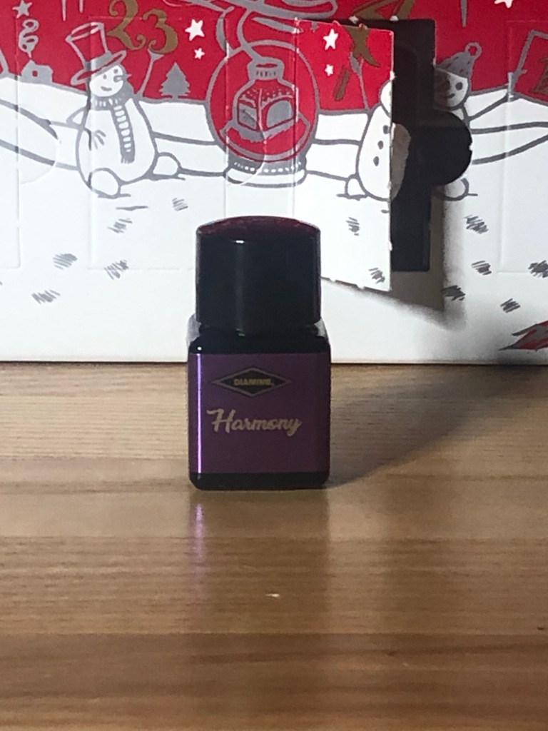
Diamine’s Day 5 ink is called Harmony. I’ll withhold my comments on the name, mostly because this was the first ink in the calendar that I looked at and instantly knew that I would like. It’s a standard purple ink, which meant that it was a colour I liked and had a low probability of giving me any issues. And through my normal testing, I’ve found that Harmony delivers on that.
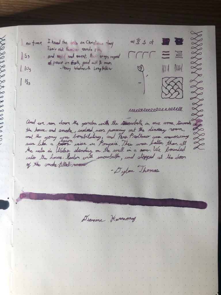
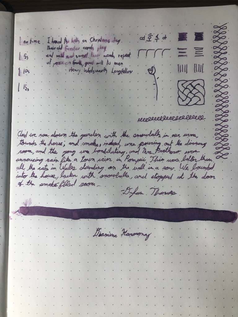
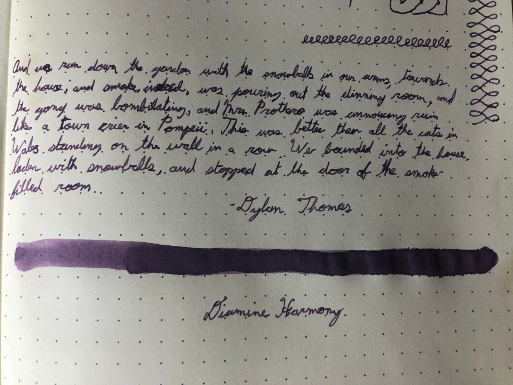
I want to start by discussing some of the ink’s properties, because it’s got a few that are interesting. Notably, it’s water resistance. I would not go so far as to say that Harmony is waterproof, but it held up surprisingly well, with only a little smudging and colour fading. Otherwise, I was able to read my writing after soaking the page. I was definitely impressed. the ink itself isn’t overly saturated, but still yields good, dark lines. It’s well behaved and I only had a little bleedthrough and ghosting. Par for the course with these inks.
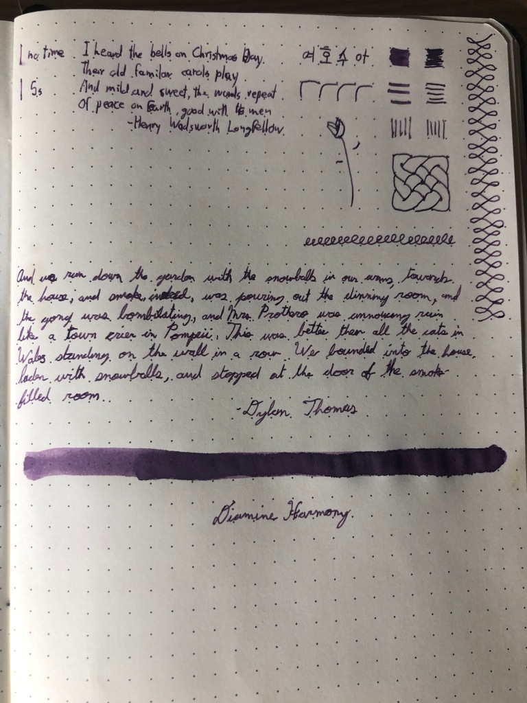
The colour is quite lovely as well. It’s a lighter purple that shades well and when I put it through a extra-fine nib, it puts down a dark purple lines suitable for writing with. It certainly feels like a lighter version of last calendar’s Winter Miracle without the shimmer in that it’s a purple that sits halfway between red and blue. It’s a personal preference to be sure, but I really enjoy this colour.
The writing experience was fairly standard. I had some feedback off the page, though not an uncomfortable amount. I didn’t have any ink flow issues and the lines were consistent. Harmony has an average drying time, though it seems to be on the shorter end of things.
Overall, I like this ink and will be looking for more of it. I like the colour a lot and have no complaints about the writing experience. The water-resistance is nice, but it doesn’t matter much to me as I try not to have liquids at my writing desk. Harmony is a good, solid ink and I think that it’s a winner on this calendar.

Good to know about the water resistance – not something I test for. I found it very close to Diamine’s Damson and R&K’s Scabiosa in swatch-form, but not yet really compared them in writing. I like the dusky purple and shading very much.
LikeLiked by 1 person