Some of the funnest inks to look at throughout the Inkvent Calendar have been the ones that are named after an idea, rather than a phyical object. While it’s cool to directly connect a colour with it’s inspiration, it’s also cool to see how the folks at Diamine assign colour to an idea.
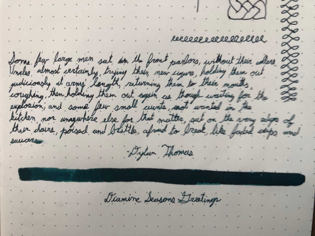
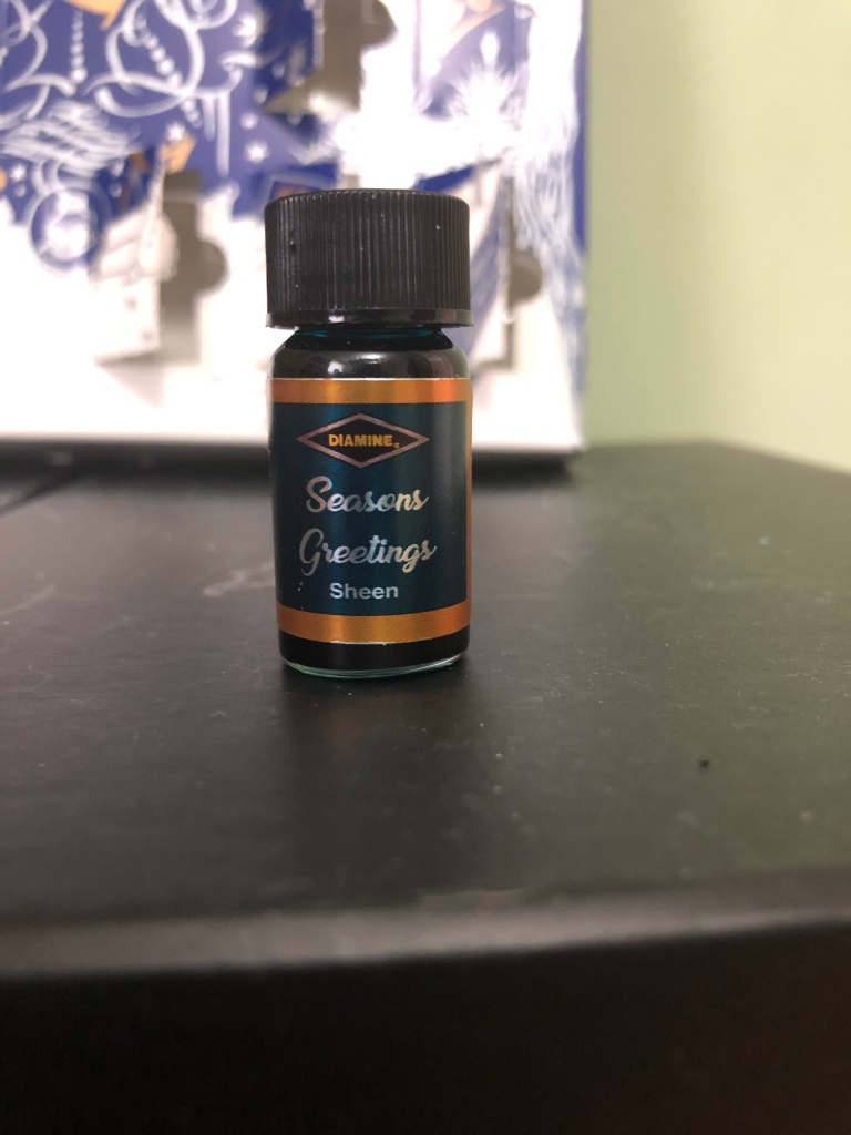
That’s what’s they’ve done with Day Sixteen’s ink, named Season’s Greetings. It’s a dark teal ink with a purple sheen. I’ve tested it on a Rhodia Webnotebook and using a Kaweco Sport extra-fine nib.
This colour is intriguing, being a rather dull colour when contrasted with some of the brighter and more vibrant colours we’ve seen. It’s rich, but feels understated. I liked writing with it, especially because it’s so dark out of an extra-fine nib, and it’s certainly a unique colour to be using. As for the sheen, it’s not overly noticeable on Rhodia paper, but I noted some lovely purple coming through here and there. an excellent addition to this ink.
The properties of this ink are pretty standard for the Inkvent series. It holds up decently against water, through it’s far from ideal, and dries in a standard times that’s just a bit long for my liking. It doesn’t smear much after five seconds, so I’m not too concerned with it there. It’s fairly saturated, ghosting through the paper, but not bleeding. through. It did surprise my by performing well on an office pad, which is a definite plus.
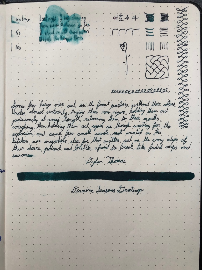
The performance was also fairly standard. Not too much feedback, but some. No ink flow issues and generally writing wet, giving nice crisp and dark lines. It does what it does very well.
Season’s Greetings is a unique ink out of the calendar. I personally like it, but I’m not head-over-heels in love with it. the colour is nice and the sheening is a nice touch, but everything else is fairly run-of-the-mill. It’s a solid ink to be sure, just not one of my favourites.