Diamine Inkvent 2021 – Day 15

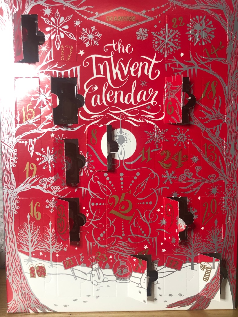
Day 15’s Inkvent ink is called Night Shade, and it’s a standard dark blue/purple ink. I’ve noticed that this year’s calandar has a bit of a darker theme, this three ink named after aspects of night and another two after storms. And an ink called Ash. Putting aside the reaching for meaning that isn’t there, I was curious to see what this ink had to offer, even though I didn’t have high hopes for it.

A bottle of Diamine Night Shade

As much as Night Shade is a dark blue, it’s the lightest blue in this calendar so far, sitting somewhere in the range of Royal Blue. It’s got purple in it, which adds to the depth of colour and was most evident on my Midori paper and less evident on my Leuchtturm and especially on my Rhodia. I feel the depth of colour is very important, as without it, Night Shade looked quite faded and I wasn’t fond of the colour. But on the whole, I was alright with it. It shades well and, when the colour’s working, it’s nice.

Diamine Night Shade on Rhodia Paper

I had an average writing experience with Night Shade. I had some feedback off the page and it was definitely on the higher end of what I prefer. However, the lines were consistent and I had no ink flow issues or hard starts. It’s a solid performing ink and I have no complaints.

Diamine Night Shade on Midori Paper

The dry time on this ink is a bit long and, while I didn’t have a major issue with it, I did smudge my writing samples in a couple of places. It’s also a quite saturated ink, which gave the ink some of its richness, but also made cleaning a bit if a chore. I also had quite a bit of ghosting and bleedthrough on this ink. Interestingly, Night Shade has more water resistance than average. It washes out, but not by much and there’s very little smearing. After my water test, I was able to make out most of my writing.

Diamine Night Shade on Leuchtturm paper

Overall, I’m fairly lukewarm on this ink. It’s certainly one that I want to revisit a bit more, but I wasn’t really blown away. The colour’s nice, but unexciting. The writing experience was decent and the water resistance was a pleasant surprise. I think that Night Shade is, when all is said and done, a good ink. But, for whatever reason, I can’t seem to get into it.

A continuation of Dylan Thomas’ “A Child’s Christmas in Wales” in Diamine Night Shade

Diamine Inkvent 2021 – Day 14

I was looking forward to testing this ink out the moment I saw it. Day 14’s Inkvent ink is called Red Robin and it’s a standard red ink. While doesn’t doesn’t sound like much, I was looking forward to something a bit different after a pair of darker blue inks.

A bottle of Diamine Red Robin

The color of Red Robin is fairly interesting. On the surface, it’s a fairly average red ink, if a bit on the darker side. There’s no shimmer or sheen to spicing things up, but it shades really well. And it’s in the shading that I noticed that this ink wasn’t completely red. In lighter areas, Red Robin appears orange. This was very noticeable in my Midori test as, to my eye, the who page was less red and more burnt orange. This certainly wasn’t what I expected, but very cool nonetheless.

Diamine Red Robin on Leuchtturm paper

The writing experience with this ink is in line with the rest of the inks in this calendar, maybe a little better. I had a fairly smooth experience wtih little feedback and consistent lines. I had no ink flow issues or hard starts and, while the lines were a bit wider than I would have liked, they were still crisp and clean.

Diamine Red Robin on Rhodia paper

Red Robin isn’t a very saturated ink, so I didn’t have much trouble cleaning out of my pens. The amount of bleed-through and ghosting that I got was nearly negligible, and the only real bleed-through was after I let ink sit for a while on my Rhodia, which always bleeds when a lot of ink is placed on it. The dry time is a bit longer than average, though not so bad that I was smudging my writing samples, and there’s no real water resistance. The ink smears quickly and washes completely out in some cases. Keep drinks well away.

Diamine Red Robin on Midori paper

There’s not much to say about Red Robin. the colour’s interesting and I have no real complaints about anything else. It’s certainly not flashy, but it is a good ink. I think what this comes down to is that I had a good first impression of Red Robin and, while I wasn’t blown away, there was nothing that let me down. Overall, it’s a solid ink and I quite like it.

A continuation of Dylan Thomas’ “A Child’s Christmas in Wales” in Diamine Red Robin

Diamine Inkvent 2021 – Day 13

We’ve just passed the half-way point of this calendar and have had some very interesting inks to test out. Today’s is no exception. Day 13’s ink is called Ruby Blues and it’s a dark blue ink with red sheen, which makes this ink one that’s exactly what it says on the tin.

A bottle of Diamine Ruby Blues

Ruby Blue is a gorgeous blue. It’s brighter dark blue, being both dark and vibrant. It reminds me a lot of Private Reserve’s DC Electric Blue. It shades a little bit, but is a mostly consistent colour, making it great for writing. The red sheen is very understated and doesn’t come through very much. Where it does, it’s a nice, shining red, but I didn’t get much of it, even on my Midori test. Now, while I was hoping the the sheen would take over the colour when light shines on it, I’m actually okay with what we have with this ink.

Diamine’s Ruby Blues on Leuchtturn paper

The writing experience with Ruby Blues was pretty good. The ink flowed well and didn’t give me any problems, and writing was fairly smooth with a little feedback off the page. The lines I got were crisp and consistently dark and rich. I couldn’t ask for more.

Diamine Ruby Blues on Rhodia Paper

Where I could ask for more is the drying time. It’s long. For the most part, the dry time didn’t really affect me insofar as I didn’t smear my writing, but I certainly smudged it a bit in all my writing samples. The ink’s also super saturated and I got a lot of ghosting and bleed-through. Cleaning my pens also wasn’t a quick process. And there’s no water resistance to speak of. The colour doesn’t wash out, but it smears quite badly an I wasn’t able to recover any of my writing after the water test.

Diamine Ruby Blues on Midori paper

Overall, Ruby Blues falls into the same category as yesterday’s Stargazer did: on the edge of inclusion to the “inks I really like but shouldn’t ever use” club. I cannot state enough that I love this colour. It’s my perfect shade of blue and the sheen is a really nice touch. And the writing experience was pretty good as well. But as a lefty, the dry time’s really important and I don’t enjoy smudging up my writing. I can still use this ink and I would buy a bottle for the colour alone, but there’s a lot that’s not ideal for me. Like Stargazer, my overall opinion is positive, but it’s carried by the colour.

A continuation of Dylan Thomas’ “A Child’s Christmas in Wales” in Diamine Ruby Blues

Diamine Inkvent 2021 – Day 12

Diamine’s Day 12 ink is an interesting one, to be sure. It’s a dark blue ink with shimmer and sheen and it’s called Stargazer, making it the second ink in a row that that I really like the name of. It didn’t strike me as very holiday related, but I’m enough of a sci-fi nerd to appreciate it. Plus, you definitely can make an argument for it.

A bottle of Diamine Stargazer

Initially, the colour of Stargazer was giving me some deja vu because I was sure we had seen something similar before. As it turns out, we hadn’t, but a lot of elements from other inks show up here. Like Tempest, it’s a dark blue ink with a bit of grey, but whereas Tempest was more grey, Stargazer is more blue and slightly teal. It sheens to red like garland did the shimmer, which isn’t overly visible normally, takes over the ink with an electric, light blue when you shine light on it, like Winter Spice did. It also shades really nicely, which is was a bonus for my stub nib. There’s a lot going on with this ink, and I like most of it. The colour’s nice, but not for me, but the sheen and shimmer show up in different spots, giving Stargazer a lot of dimensions.

Diamine Stargazer on Midori Paper

The writing experience was also interesting, but not always in a good way. I had some ink flow issues and hard starts, which I’ve come to expect. However, it only took a few moments to get this ink going again and when it did, it was actually smoother than normal, if a bit more wet. The lines once the ink was flowing were thick, but consistent and rich with colour. Overall, it wasn’t too frustrating to use, but there was definitely issues.

Diamine Stargazer on Leuchtturm paper

Stargazer is very saturated and I got quite a bit of bleed-through. Cleaning out my pens wasn’t a treat either. It smudges quickly when exposed to water and while it doesn’t wash out easily, my writing was incomprehensible after my water test. It also has a longer dry time, which didn’t affect me as much as usual, but certainly posed a concern for me.

Diamine Stargazer on Rhodia Paper

I’m not sure what I think of this ink. There’s a lot I like, but a lot that’s also less than ideal. It doesn’t make it into the “Inks I love but shouldn’t be using club,” on the basis of me being able to use it, but it’s got it issues. The writing experience wasn’t great, but not catastrophically bad. The dry time’s longer than I like and the issue of water resistance is never a make-or-break issue for me, but it stands out when there’s a lot I don’t like. That said, I’d probably buy a bottle of this ink for the colour along. And that might be enough to push me into having an overall positive opinion of Stargazer.

A continuation of Dylan Thomas’ “A Child’s Christmas in Wales” in Diamine Stargazer

Diamine Inkvent 2021 – Day 11

Diamine’s Day 11 ink is called Party Time, which is a heck of a name to go with a heck of a colour. It’s a purple ink with shimmer, which sounds like it fits the brief to a “T,” but my testing showed me that this wasn’t the ink that I was expecting, but in the best possible way.

A bottle of Diamine Party Time

Party Time isn’t a bog-standard purple. It leans a bit more red, bordering on magenta and I could also see an argument for it being a dark pink. It’s actually really complex and impressive. What isn’t up for debate is that I really like the colour. It’s rich and vivid, shades nicely and is just all-around lovely. Another surprise for me was the use of shimmer in this ink. I thought we might have a very shimmer-heavy ink on our hand, but it’s very subdued. You don’t see much of it, maybe a fleck or two of blue in your writing, and, even when you hold it up to light, the shimmer doesn’t take over the colour like a few of the other inks we’ve had.

Diamine Party Time on Midori Paper

The writing experience was unexpectedly smooth. I suspect that it’s because there’s either less or smaller shimmer particles in Party Time, which meant it avoid most of the issues that an extra-fine nib poses. I had very consistent ink flow, no hard starts and the ink was almost too wet in places. It’s very well-behaved and a pleasure to write with.

Diamine Party Time on Leuchtturm paper

This is a fairly saturated ink, but I didn’t have too much trouble cleaning it out or my pens. I also didn’t have ghosting and only a little bleed-through with Party Time, which is really impressive. The dry time is short to average and the only drawback is the lack of water resistance. And even then, it was as expected. Party Time smudges easily and washes out, making it very difficult to recover your writing once liquid’s gotten on it.

Diamine Party Time on Rhodia paper

This may be a bold statement, but Party Time’s an absolute winner for me. I love the colour, I love the effects and it preformed very well in my tests. I’m going to be looking to buy a bottle if I get a chance and, if you like purple-ish inks, I would recommend this one to you.

A continuation of Dylan Thomas’ “A Child’s Christmas in Wales” in Diamine Party Time

Diamine Inkvent 2021 – Day 10

Day 10’s ink was another took me places that weren’t necessarily holiday related, though this time I wasn’t lead to think about a musical about vampires. Instead, I was taken down the path of nostalgia by Peach Punch, which was my absolute favorite juice box when I was young. I would almost go so far as to say that it was objectively the best. Pontification about boxed drinks aside, Diamine’s Peach Punch is firstly not meant for drinking, and secondly, a standard orange ink. I was curious to see where Diamine went with this and testing was a bit of a blast.

A bottle of Diamine Peach Punch

Peach Punch is a robust orange ink, which surprised me. Even with a broader nib, I didn’t get many light area or shading that would have matched what I was expecting. I thought it might be something a bit lighter and with more yellow. That said, it is a pretty nice, if basic, orange. It’s good for writing with and, if there is a complaint, it’s not going to be that it doesn’t look good. Peach Punch has no shimmer or sheen, which, as much as I like those effects, was absolutely the right call.

Diamine Peach Punch on Midori paper

The writing experience of this ink was also pretty standard. Peach Punch wrote smooth enough with a little feedback off the page. I didn’t have any ink flow issues, the lines I got were consistent and sharp, and I wasn’t uncomfortable when writing with it. In short, it did everything I could have asked for.

Diamine Peach Punch on Leuchtturm paper

This ink isn’t very saturated. In fact, you can look clear through it in the bottle. This made clean up fairly easy and I didn’t get much ghosting through the page. I was surprised to see some bleed-through as I didn’t expect an ink like this to do so, but it was significantly less than most of the inks ink this calendar. The dry time was fairly short, which was expected and welcome. Peach Punch also puts up a decent fight against water, taking a while for it to smudge, but it also washes out after a while, making it impossible to see what I wrote. Definitely not an ink you want near your drink

Diamine Peach Punch on Rhodia paper

Overall, I can’t complain about Peach Punch. It’s a fun ink with a good colour and nothing that makes using it a chore. I definitely see myself using up this bottle in the future. However, it’s not a particularly exciting ink for me. Orange is not my colour and there’s nothing about it that makes it a must-have. So it’s probably not going to be on my wish list going forward, but I think that if you have it on yours, you’ll really like it.

A continuation of Dylan Thomas’ “A Child’s Christmas in Wales” in Diamine Peach Punch

Diamine Inkvent 2021 – Day 9

Diamine’s day 9 ink is called Storm, and I will admit to frowning a bit when I saw it. It’s a dark blue ink with shimmer and if that sounds familiar, you’ve obviously seen day 4’s ink. To address the hippopotamus in the room, Tempest and Storm share a lot of similarities, and it does seem odd that there’s only 5 days separating these inks on the calendar. Both are dark blue ink with shimmer, with names that are synonyms of each other. Obviously, I didn’t expect a complete repeat, but I was curious to see what the differences were.

A bottle of Diamine Storm

As I’ve noted, Storm is a dark blue and it has a hint of grey in it as well. It’s not a dark as Tempest, but I would call it a lighter version. Interestingly, and so far as I can tell, this colour hasn’t been done in an Inkvent calendar before. In fact, it has significant differences when compared to inks that I would consider the closest. This is impressive considering there were six blue inks in the last calendar. The shimmer is also a major difference, as it’s a sliver shimmer and not as prominent as Tempest’s gold. You catch a glint of it every so often, and it’s a rather nice, understated, effect.

Diamine Storm on Leuchturm paper

The writing experience was as rough as I expected it to be. There were some ink flow issues and hard starts, and I got a lot of feedback off the page. It wasn’t horrible, but fairly annoying. When you get this ink flowing, it’s actually not a bad experience, but it takes a while and you’re not guaranteed to get it to work well. Of course, Storm preforms better in broader pens and I had no trouble with my 1.1 stub.

Diamine Storm on Rhodia paper

Besides that, Storm’s pretty well behaved, It didn’t have much bleed-through or ghosting with this ink, which was a bit surprising considering the vibrancy of the colour. The lines I got were crisp and didn’t spread much, though that could be down to having limited ink flow at times. The dry times are also pretty short, which is great to see as a lefty.

Diamine Storm on Midori paper

As for water resistance, I’m going to say that Storm holds up alright. It’s certainly not water resistant by any standard, smudging instantly at the first touch of water, but after drying, my writing was decently clear. The Midori paper washed completely out, but the other two sample was legible, if quite faded.

Three Water Tests of Diamine Storm on three papers

Overall, Storm is more impressive than I thought it would be. It is, despite my reservations, and unique colour, and a nice one at that. It does a lot of things well and I can’t nitpick on it. Of course, my experience with shimmer inks continues to be an issue, but I have to acknowledge that my normal usage isn’t where these inks excel. So, I think Storm’s a good ink and I might consider it for my “to buy list.”

A continuation of Dylan Thomas’ “A Child’s Christmas in Wales” In Diamine Storm

Diamine Inkvent 2021 – Day 8

I have to admit that I was bemused when I saw the name of Diamine’s Day 8 ink. It’s called Raspberry Rose, which I’ll admit, I first read as Raspberry Pie, which is why my testing sheets are labeled as such. Mistakes aside, the name matches the colour and Raspberry Rose is the colour of cooked-down raspberries, which I can’t pin down. I’m going to call it a magenta for the sake of this review, but I’m well aware that I could be wrong. That said, I was pretty excited to run this ink through my tests.

A bottle of Diamine Raspberry Rose

Despite not knowing what to call this colour, I do know that I like it. Raspberry Rose is a lush, dark colour, which makes it a really good writing ink. It shades nicely and the variation between dark purple and dark pink is very interesting. It’s a standard ink, which means there’s not much going on beyond what you see, but I don’t think there needs to be here. It’s an extremely nice colour. The one criticism that I would level at it is that it’s a bit close to last Calendar’s Mulled Wine. I don’t hold that against the ink itself, but it’s worth noting for the calendar overall.

Diamine Raspberry Rose on Rhodia Paper

I had a really good writing experience with this ink. It writes smoothly and consistently, with no ink flow issues, and I got really rich lines from it. I also didn’t get much feedback off the page. There was certainly some, but this is the closest I’ve gotten to having a pen glide on paper in a while. The ink itself is highly saturated, and I did have a lot of ghosting and some bleed-through. Nothing major, but more than usual.

Diamine Raspberry Rose on Leuchtturm paper

The dry times on Raspberry Rose are on the long end of average, though the Leuchtturm paper is inflating that a bit. On Midori and Rhodia paper, I had no issues with the dry time, but I did smear some writing on the Leuchtturm. There’s not water resistance with this ink. It smears immediately on contact with water and my writing is washed out pretty quickly. In most cases, I wasn’t able to read what I had written after the water test.

Diamine Raspberry Rose on Midori Paper

Overall, I’m a big fan of this ink. Raspberry Rose is a lovely colour and a nice ink to be using. It does everything I want it to and didn’t give me any trouble, and I happen to like the colour. Based on the ink alone, I think I’d be willing to buy a bottle of it, were it ever available. Of course, there is one glaring issue: the similarity to Mulled Wine, but I think I’ll touch on that more after I’m through the calendar.

A continuation of Dylan Thomas’ “A Child’s Christmas in Wales” in Diamine Raspberry Rose

Diamine Inkvent 2021 – Day 7

Candlelight is Diamine’s Day 7 ink, which is a perfectly festive name for a festive ink. It’s a standard yellow, evoking the flickering glow of a lit candle, but doesn’t have any other complexity immediately obvious. And none cropped up through my testing procedure, making this a “what you see is what you get” ink.

A bottle of Diamine Candlelight

Yellow inks aren’t something that I look for. The colour itself is not on my list of favorites and I like using inks with more contrast to the paper. However, I found this one to be quite good. It’s a rich, darker yellow, which helps it stand out off the page and makes it suitable for writing with. It shades a little, and it’s an interesting effect that I’m not sure that I like. I don’t hate it, but I do wonder if I would have preferred dark, uniform lines with this colour. I was tempted to compare it to last year’s Gold Star, but you can’t really say that this is Gold Star without the shimmer. Candlelight is darker and, dare I say, has a bit more personality.

Diamine Candlelight on Leuchtturm paper

The writing experience with Candlelight was as expected. It was a bit dry and I got quite a bit of feedback off the page, and it was on the high end of tolerable for me, but not really notable. I didn’t have any ink flow issues and the lines I got were clean and consistent. I had a little bit of bleed-through and ghosting, but in the same circumstances that I’ve seen it before in this series of inks. Overall, no surprises.

Diamine Candlelight on Midori paper

The dry time on Candlelight is on the shorter end of average, which is nice. Coupled with the darker colour and consistent ink flow, I didn’t have any concerns when using this ink. There is no water resistance to speak of, but this was totally expected. This ink smudges quickly and washes out pretty easily. I would keep liquids well away.

Diamine Candlelight on Rhodia paper

There is something to be said for being a solid ink with no surprises, and that’s what Candlelight is. When I saw what this ink was, I had a pretty good idea of what I was getting into and my testing confirmed what I thought: it’s an average ink. As a result, I have no complaints. So the question becomes about the colour, and it’s not for me. But if you like yellow inks, I don’t think you can go wrong with this one, and, for what its worth, I’ll happily use up my bottle.

A continuation of Dylan Thomas’ “A Child’s Christmas in Wales” in Diamine Candlelight

Diamine Inkvent 2021 – Day 6

Day 6’s ink is called Winter Spice and its entirely fitting that it is a brown ink. I personally like brown inks since there’s so much that you can do with them. Add a bit of shimmer and sheen, and this ink was shaping up to be something really interesting. And once I put it through my testing procedure, it became really apparent that it was.

A bottle of Diamine Winter Spice

It’s really difficult to show off Winter Spice’s colour in pictures, which is unfortunate since it’s wild. The base colour is relatively dark brown that leans towards being a bit red. It shades really nicely and a broader nib helps show it off. But it’s also dark enough to write with. There’s a bit of shimmer in Winter Spice, but it’s not as apparent as other ink’s I’ve tested. It’s certainly present and you’ll see a glint of it here and there, but it certianly doesn’t dominate unless you shine light directly at it. Even then, it’s more subdued. However, it serves to compliment the sheen well, as this ink turns teal under light. The whole thing is actually spectacular and I’m a big fan of it.

Diamine Winter Spice on Leuchtturm paper

Now, you might be expecting me to talk about how troublesome this ink was to write with. Indeed, I was ready to talk about how rough Winter Spice was to use. Except, it wasn’t. This ink flowed really well and I didn’t have any ink flow issues and only a couple of hard starts. Those were after letting my pen sit for a while and they picked up very quickly. The lines I got were thick and smooth and the overall experience was really nice. I will say that this ink might actually be too wet for my liking and the lines too think, but given the choice between a wet ink and one that doesn’t flow, I’ll pick the wet ink every time.

Diamine Winter Spice on Rhodia paper

Winter Spice is very saturated, which made cleaning my pens take a bit longer. It makes for dark and rich lines, but also leads to there being some bleed-through and ghosting. There was a bit more than I was expecting, but not so much more that I would call it out of the ordinary. The dry time on this ink is pretty long, but shouldn’t be an issue for most people. As for water resistance, there isn’t any. Winter Spice smudges very quickly, washes out and doesn’t give you much of a chance to recover your writing.

Diamine Winter Spice on Midori paper

Overall, I’m trying to keep myself from gushing over this ink. Winter’s Spice’s colour is amazing and I was pleasantly surprised by it’s writing experience. Yes, it has a few issues, but the pros far outweigh the cons. I’ll definitely be on the lookout for more of this one.

A continuation of Dylan Thomas’ “A Child’s Christmas in Wales” in Diamine Winter Spice